Page 1 of 2
Aniku's WIPs
Posted: Thu May 30, 2013 2:14 pm
by Aniku
Hi everyone.
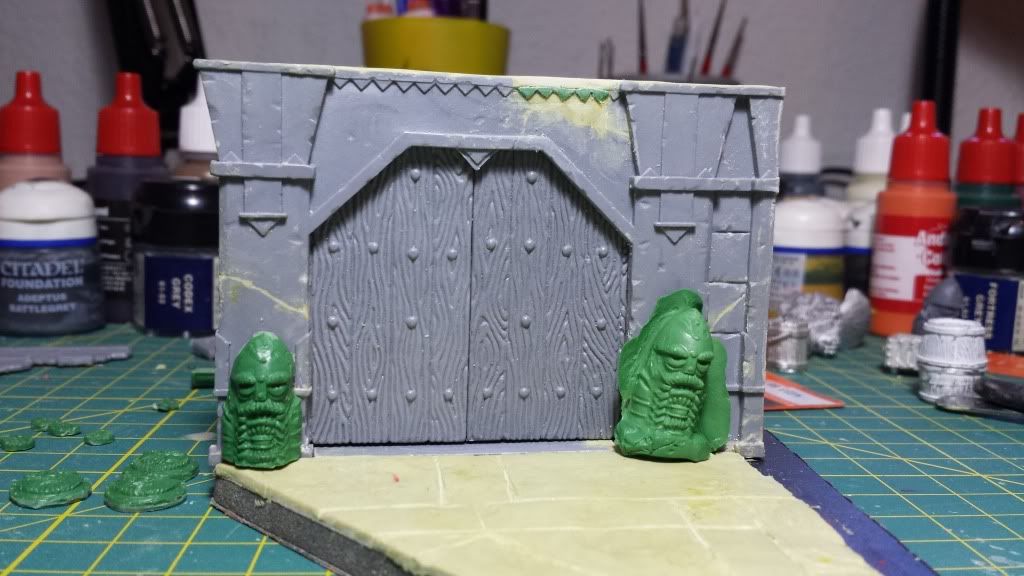
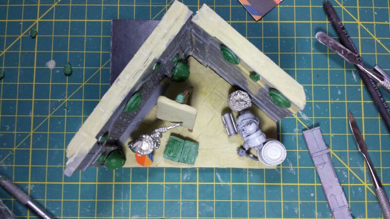
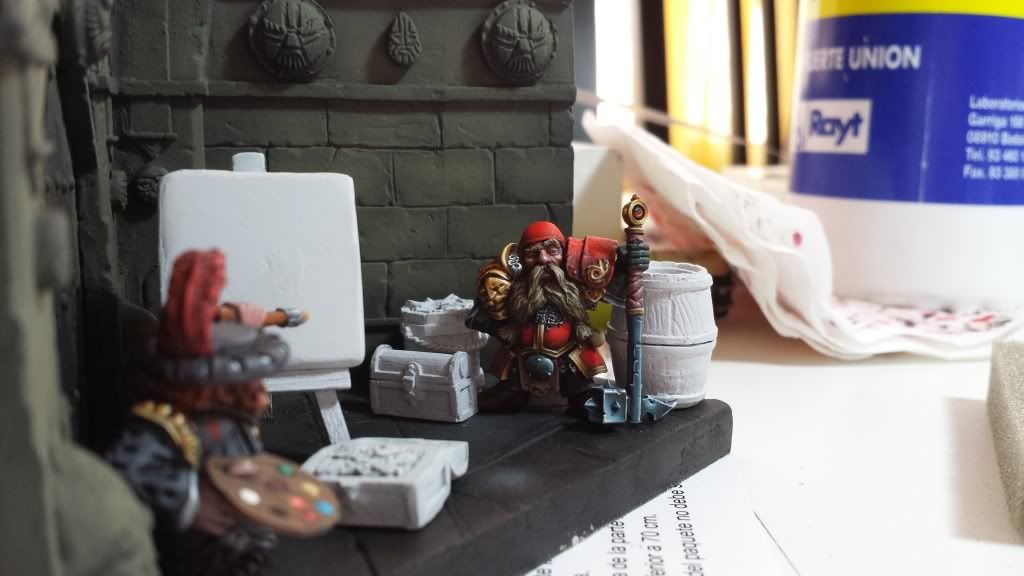
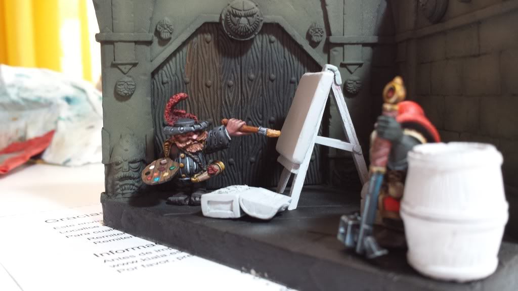
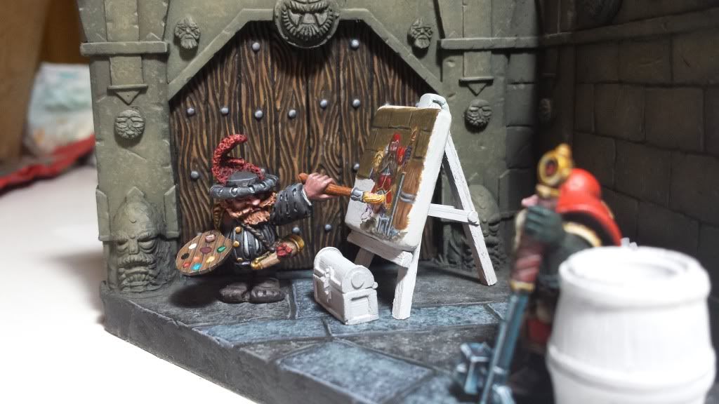
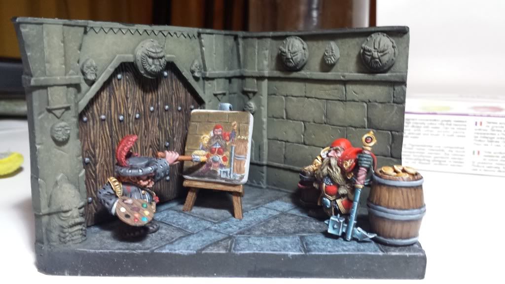
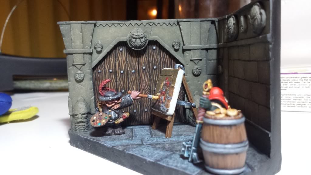
I'm working on a little diorama with a couple of dwarfs. I have called it "The painter and the Noble". Now I'm finishing the scenerio but I accept any advices o sugerence.
Here you have some pic.
The concept:

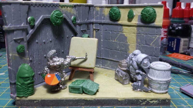
Some advances:
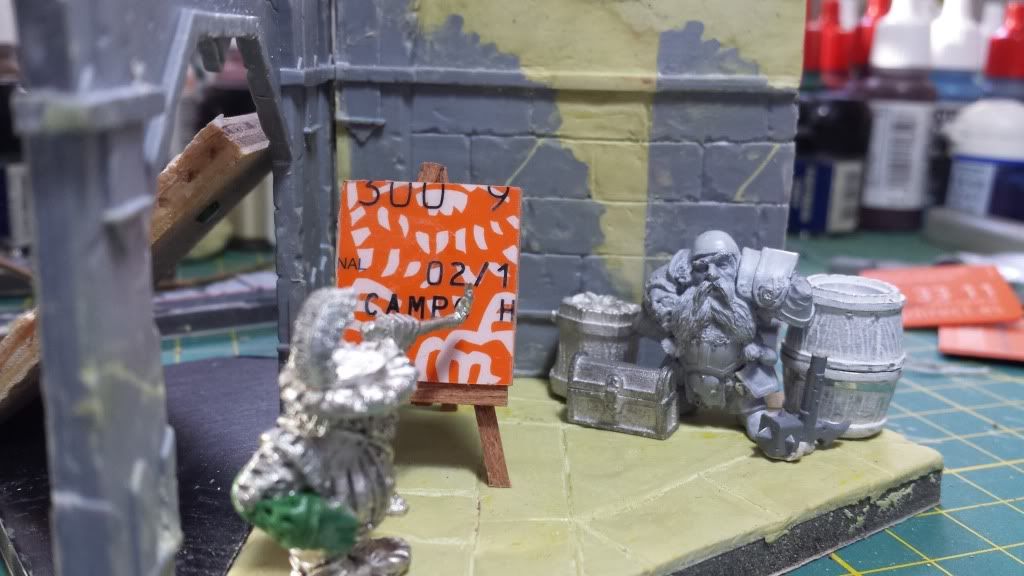
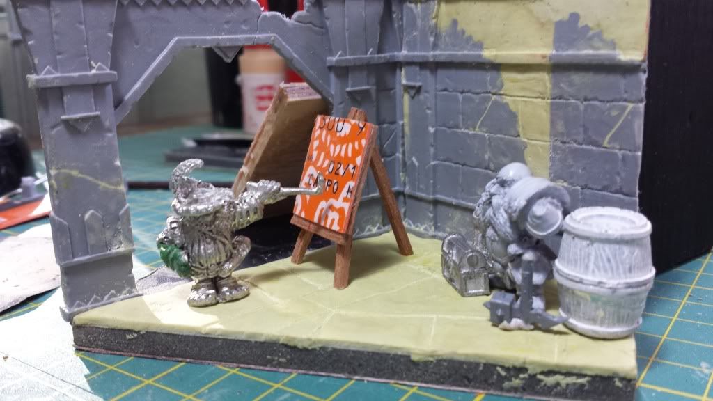
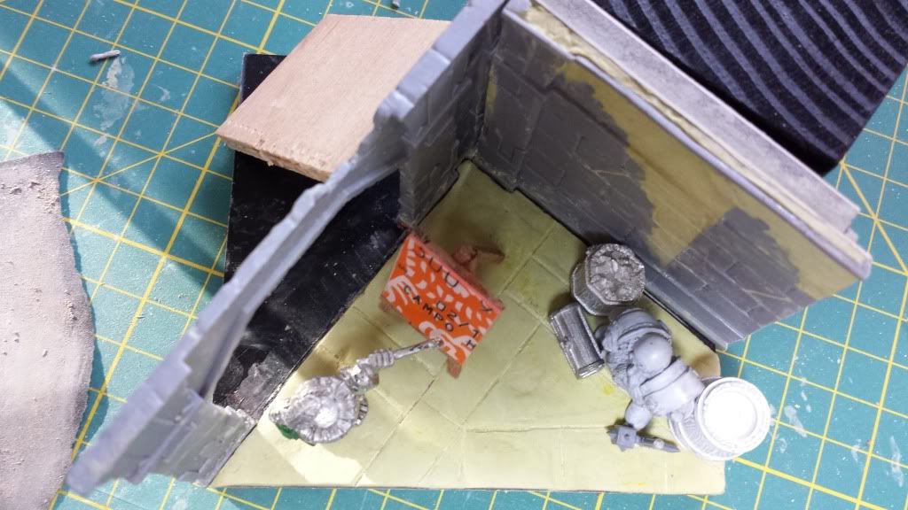
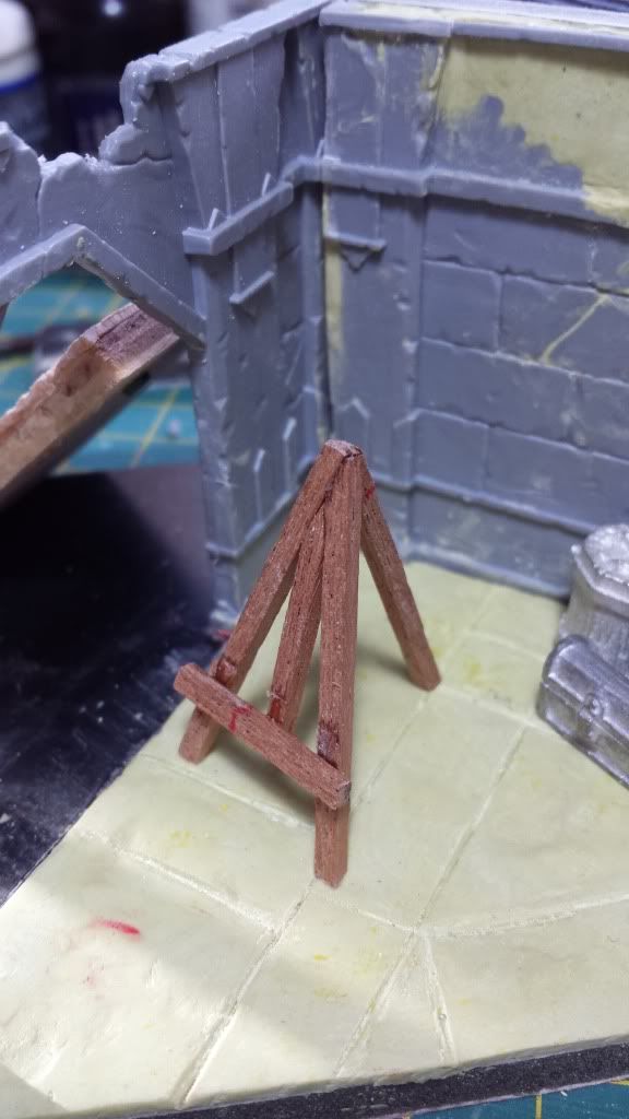
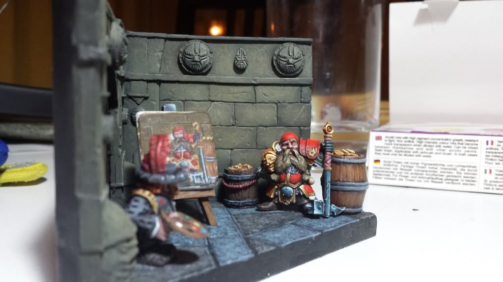
The actual state:
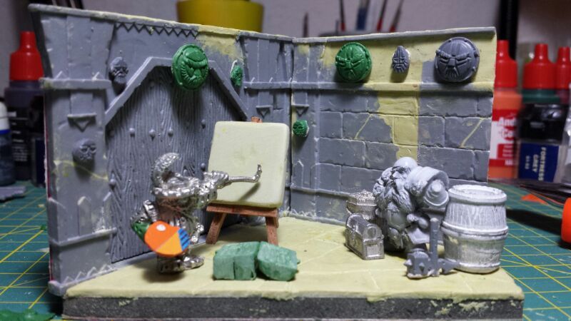
And a question. Do you think the dwarf statues could be a good added to the diorama or maybe its too many things in such small space? I'm not quite sure if I have explained correctly myself because my english is not the best one
Hope you like the idea and the way I'm doing it. Please feel free to leave a comment or advice me.
Many thanks.
Bye!
Re: Aniku's WIPs
Posted: Thu May 30, 2013 6:51 pm
by AndyS
Great stuff and great use of old gw cannon crew!
Re: Aniku's WIPs
Posted: Thu May 30, 2013 7:40 pm
by Aniku
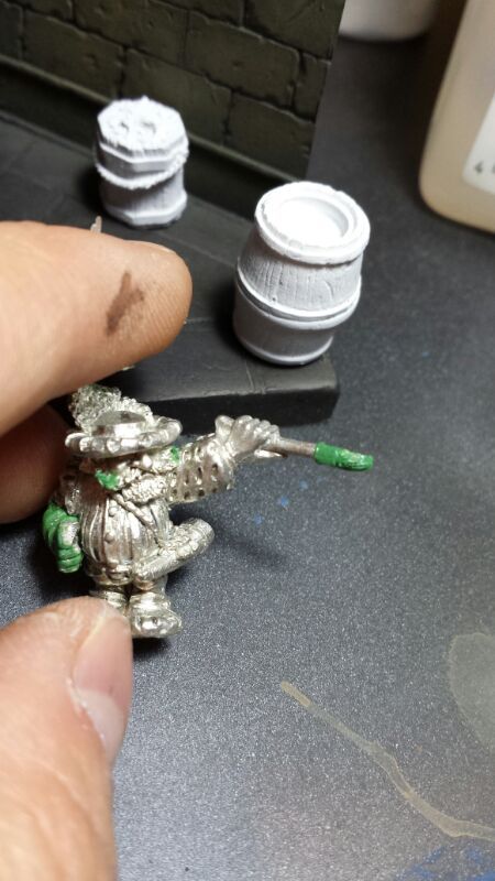
Thank you AndyS. First time I saw this miniature I thought he looks like a painter. Some time later I get Thorvin and thought he looks like he was like posing (not sure if that word exits in english).
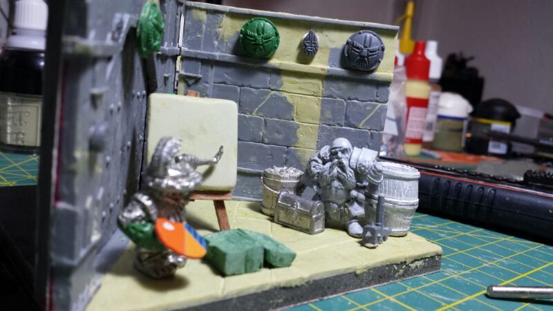
I have done pics with all elements. I think add the dwarf statues are not too much for the scene. Now the dwarf ornaments stand out becouse of the different color. Once painted in the same color they won't stand out.
The pics:
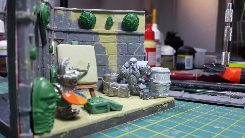
What do you think??
Hope I'm not rude with so many pics and so many questions.
Many thanks.
Bye!
Re: Aniku's WIPs
Posted: Thu May 30, 2013 7:46 pm
by Azhrarn
You're really talented Aniku, that looks really good.

The pictures aren't a problem, this is a "work in progress" section of the forums, which is exactly the right spot to post lots of pictures of your work.

And I doubt anyone minds the questions, those whose skills match up to yours (mine most certainly don't) can provide meaningful feedback that way.

Re: Aniku's WIPs
Posted: Thu May 30, 2013 7:49 pm
by AndyS
Not rude at all. Posing is the right English word by the way.
Re: Aniku's WIPs
Posted: Tue Jun 11, 2013 8:19 am
by Aniku
Hi
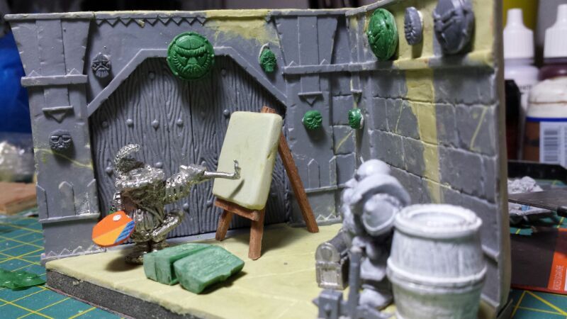
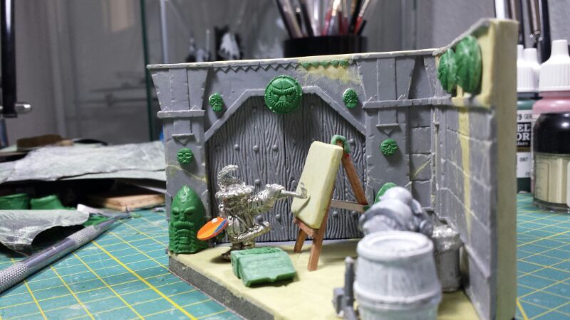
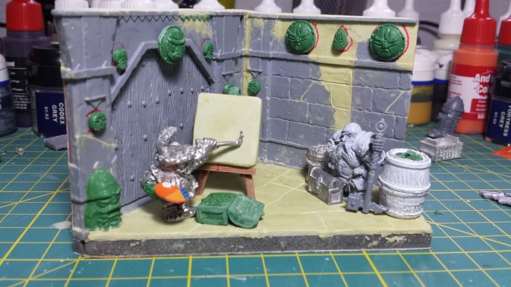
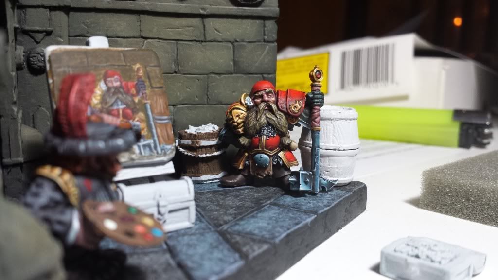
I have not been able to advance on everything I wanted although I did some progress that can be show.
At the end I have integrated the statues on the sides door but lowering them height and the bottom. The truth is that I like as they look. The weapon of the noble dwarf is also nearly finished. I have added in the chest small cans which I will paint like oleo cans. The dwarf details are already glued to the wall. I have added coins (not sure if you can see it) on large barrel. I think thats it. Here you have some pics:
Hope you like it and that you continue giving me advices.
Many thanks.
Bye!!
Re: Aniku's WIPs
Posted: Tue Jun 18, 2013 8:52 am
by Aniku
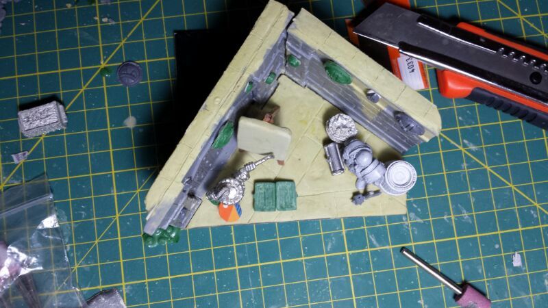
Finally I found time to continue with the scene
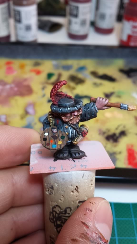
I have advanced with the painter so now he has a real brush and I have grow up his mustache in order to make him looks like more like the spanish painter Velazquez.

On the scene I have two options of colour. In my opinion the second one is much better but I want to know what do you think...

Hope you like it.
Many thanks.
Bye!!!
Re: Aniku's WIPs
Posted: Sat Jun 22, 2013 11:00 am
by RayzrYR
very good! Definitely the second option.
Re: Aniku's WIPs
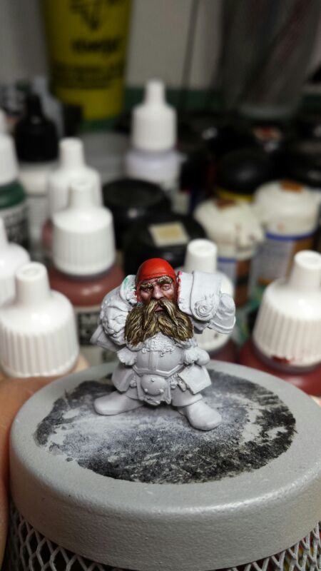
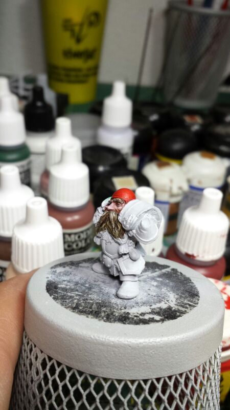
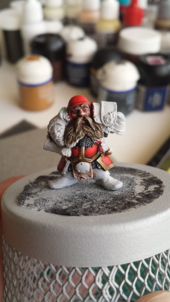
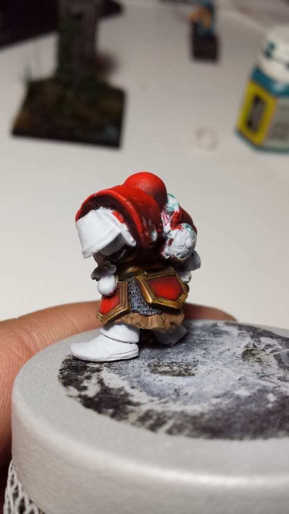
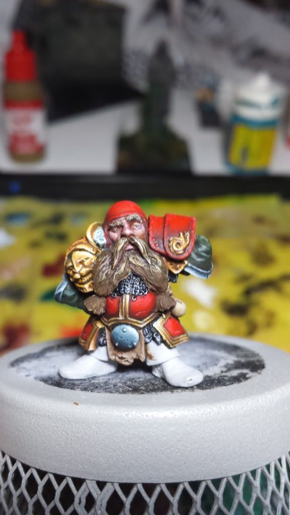
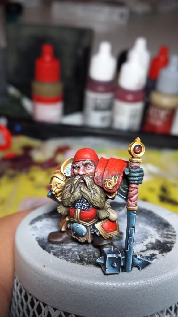
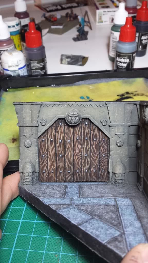
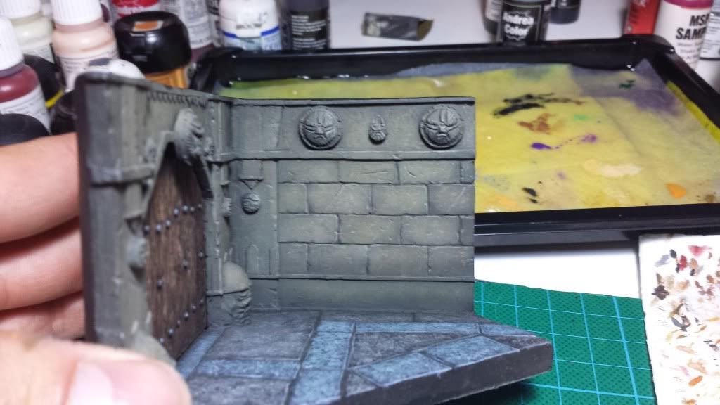
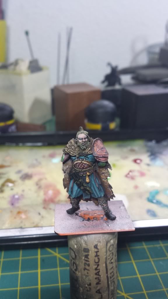
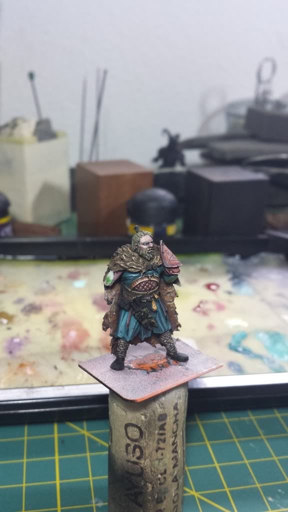
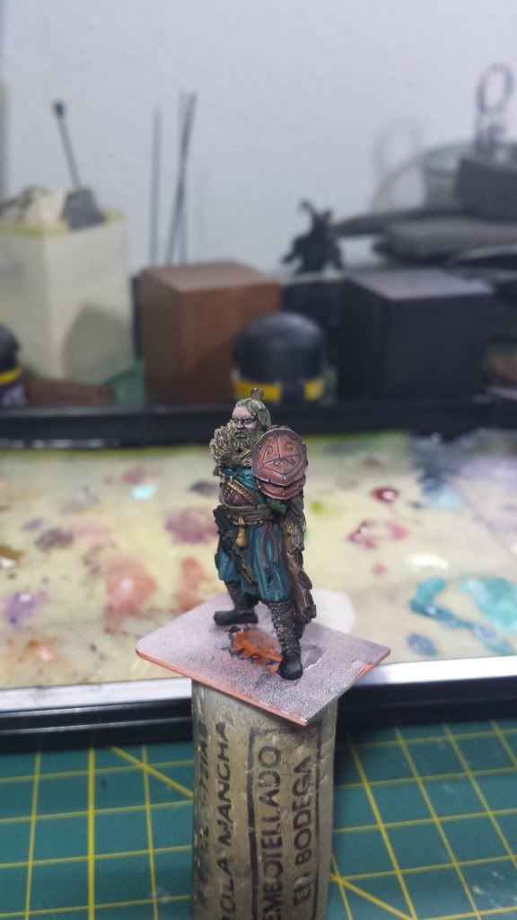
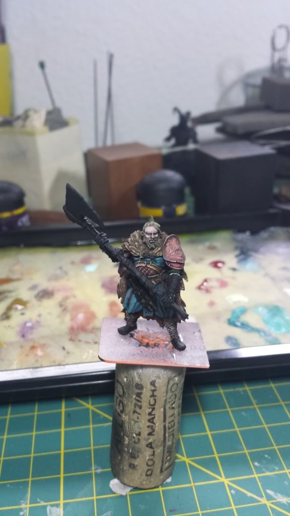
Posted: Wed Jun 26, 2013 8:37 am
by Aniku
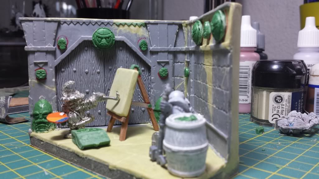
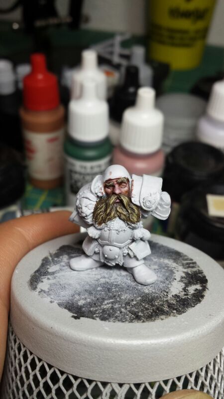
Some minor advances.
Finally I choose the second option for the stone color. I have added more light to the walls before I get onto the oils paints work. Any advice from someone who has used the oils paints before to create a realistic rock? I have to sharpen the light before the oils paints, right?
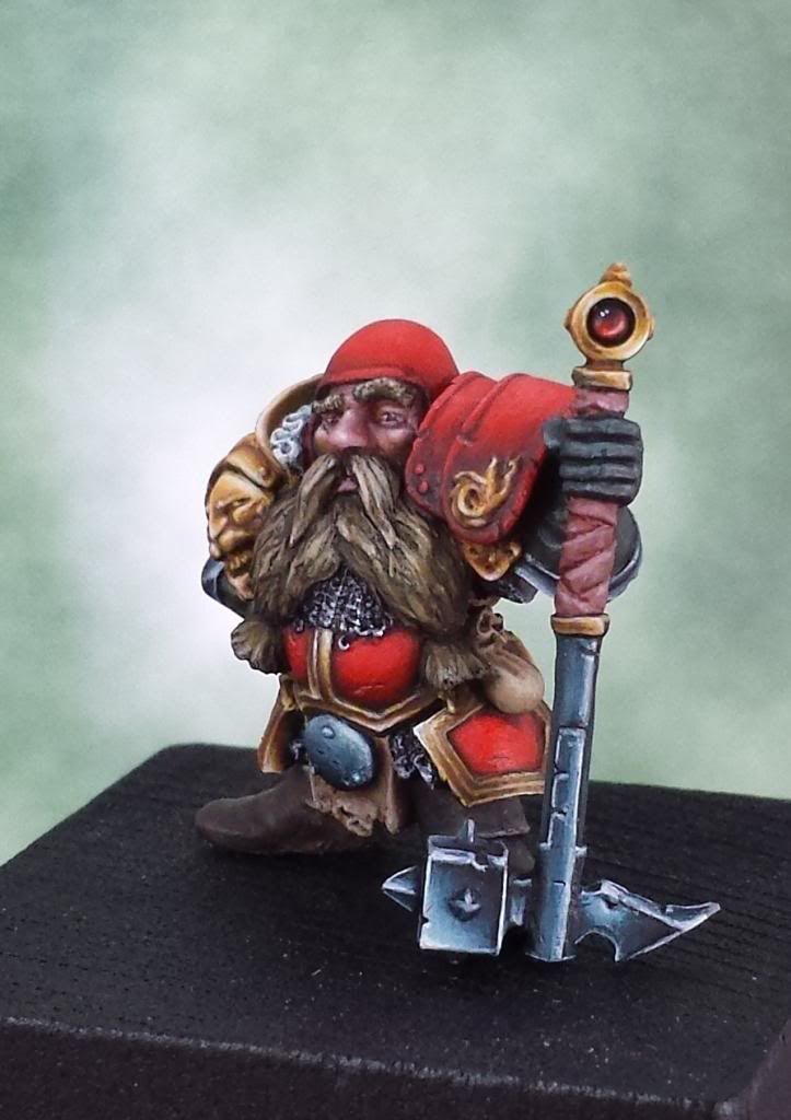
And I dont know how but I have began with the noble's face...
Here I really need your help. I have many doubts with the beard, what you can see on the pics is just a try. The armour will be paint in red and the metallic details in golden so maybe the color of the beard is not the best option (very similar colors between the beard and the metalics details). On the other hand, do you think the face have enough contrast? (never is enough contrast!!!) Do you think the face needs deeper shadows or higher bright ? The light come by the left side of the face of the noble.
Many thanks!!
Bye!!
Re: Aniku's WIPs
Posted: Wed Jun 26, 2013 5:25 pm
by Azhrarn
That face looks astounding

Really amazing, there's already so much detail in that.

The beard will probably end up fine, providing you don't make the gold accents too prominent.
The red is is going to provide the contrast with the beard, and as long as the red doesn't disappear in the gold accents it could work rather well.
But given the obvious talent you have, I anticipated that you'd have quite the grasp of colour theory.
Re: Aniku's WIPs
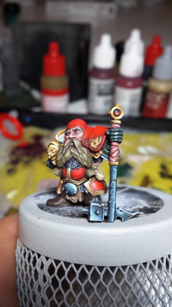
Posted: Tue Jul 02, 2013 7:34 am
by Aniku
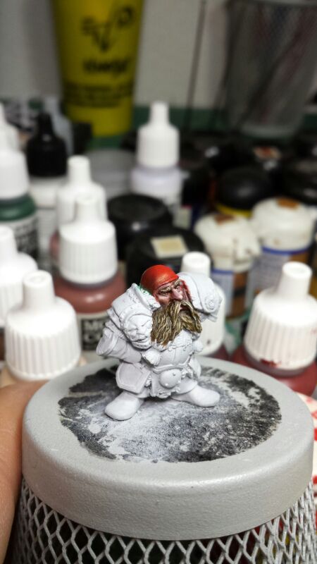
Hi, How are you?
Yesterday by night I had an hour and a half free and I got back to paint the noble face.
I have tryed to get more contrast on the skin and also fix some error on the eyes. I got more advances on the beard and I have also began with the helmet in order to find the red colour that I'm looking for the armour tone. Now you can see that it is too bright so I have to paint it darker before I continue.
The pics:
Ahora toca parón que tengo dos semanas de vacaciones.
Muchas gracias a todos.
Ciao!
Re: Aniku's WIPs
Posted: Thu Aug 01, 2013 12:54 pm
by Aniku
So here Im back.
Vacations and a project that, by now, is top secret, I have been out but today I can add a small step...
The truth is that I am not convinced of the golden NMM, both by the resemblance with beard and a finished little bit dirty, so I hope to repaint it today in the afternoon. Fixed the right eye but I have to sharpen a bit in light. The right eye have to look more to the left. Red it is convincing me more, especially on the belly.
To see what you will appreciate:
Hope you like it.
Bye!
Re: Aniku's WIPs
Posted: Thu Aug 01, 2013 1:22 pm
by razormage
Looking great! I must confess, though, to being almost as intrigued at the Legado de Yuste in the background... glad to see I'm not the only one who drinks Belgian Monastic-style beer while painting! That's not one I've ever heard of; I'll have to see if I can find a distributor in Texas who can get it.
Re: Aniku's WIPs
Posted: Thu Aug 01, 2013 1:30 pm
by Aniku
[Offtopic on] Here you have a review. Not the best beer but i like it, even more painting
http://beeradvocate.com/beer/profile/41 ... ba=AlexLMS [Offtopic off]
Re: Aniku's WIPs
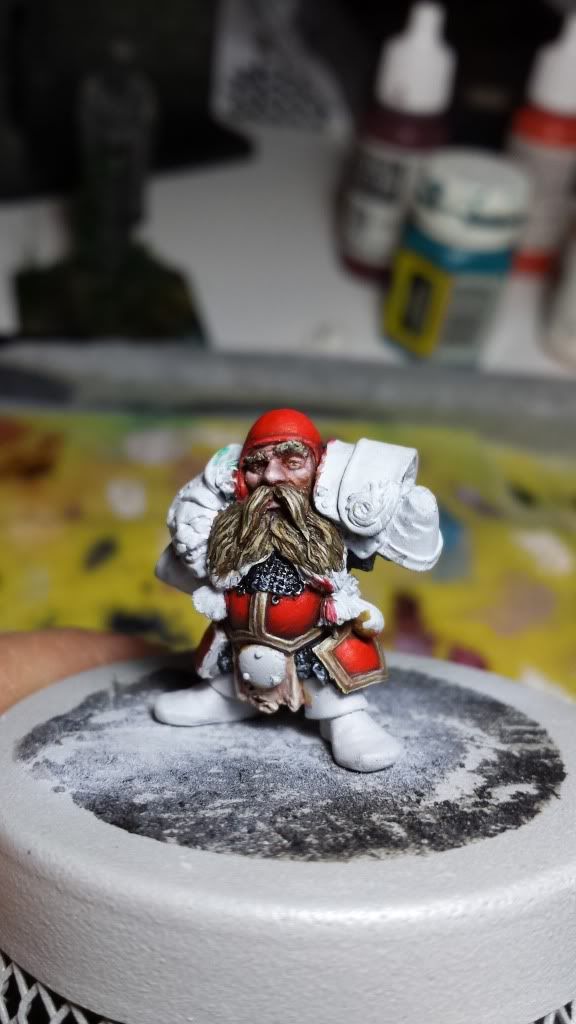
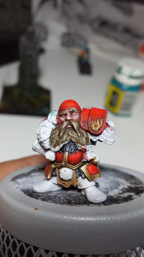
Posted: Thu Aug 01, 2013 7:58 pm
by Aniku
I have repainted the golden nmm and I believe now looks better. I have also done some work on the red armour (highlights) and on the nose and eyes, which needs some last work fo finish them.
The pic...
Thank you.
Bye!!!!
Re: Aniku's WIPs
Posted: Fri Aug 02, 2013 3:22 pm
by Azhrarn
Looks really awesome Aniku.
Should turn out great, love how the reds pop, and the gold is nice and subtle.
Re: Aniku's WIPs
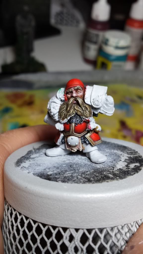
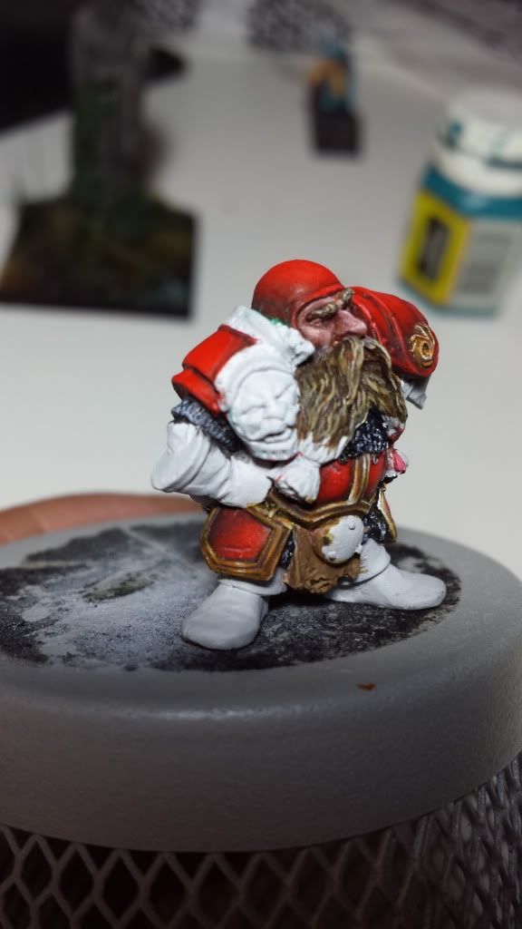
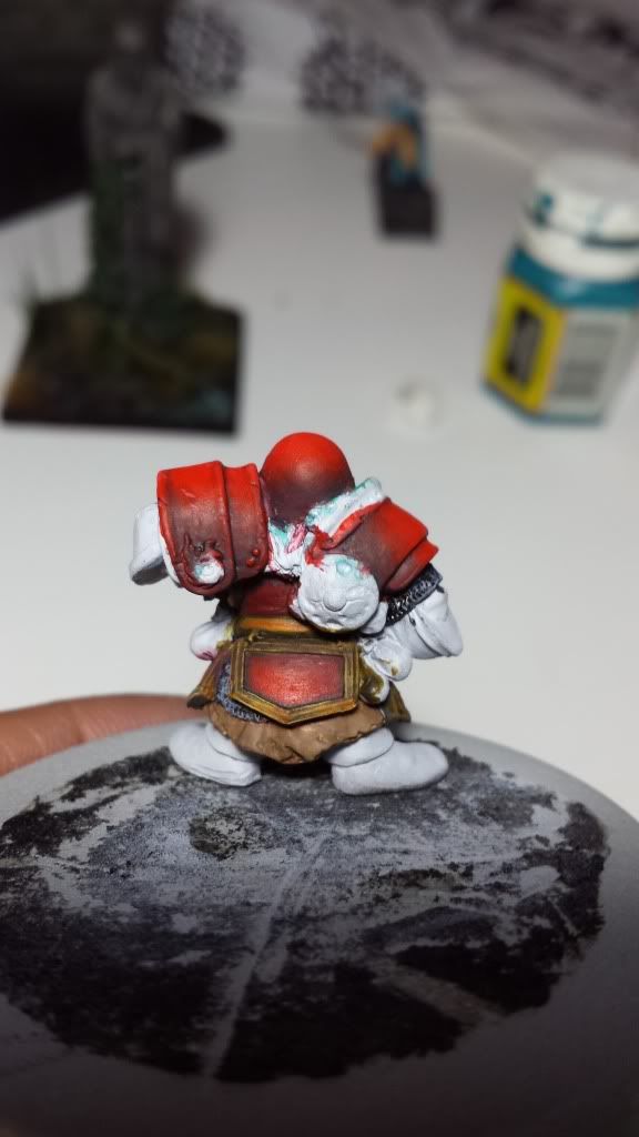
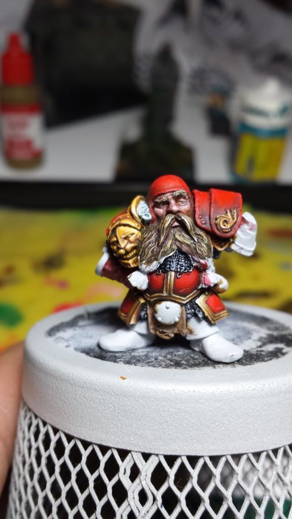
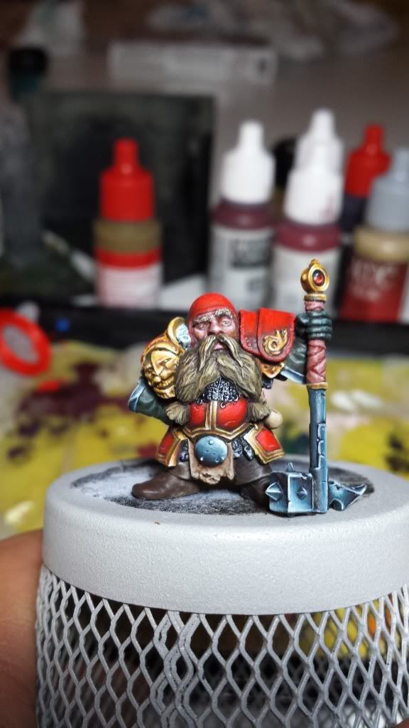
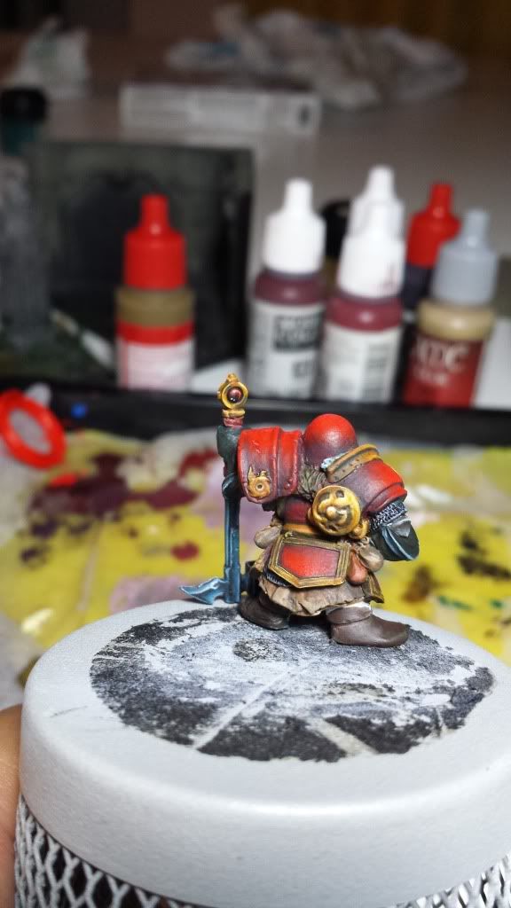
Posted: Tue Aug 06, 2013 7:57 am
by Aniku
I'm back, and I'm bringing some advances...
More work on the goldens and some advances on the reds of the armour. The back part looks worst but you have to remember that the wall will cover it.
The pics:
Hope you like it.
Bye!
Re: Aniku's WIPs
Posted: Wed Aug 07, 2013 8:11 am
by Aniku
So here are new advances in the golden nmm that I hope to leave today finish...
Some final advice?
Many thanks.
Bye!
Re: Aniku's WIPs
Posted: Wed Aug 07, 2013 11:36 am
by AndyS
I'm no NMM expert but I think it needs more contrast. At least more highlighting.
Re: Aniku's WIPs
Posted: Wed Aug 07, 2013 12:10 pm
by razormage
I agree with AndyS. I think it needs at least one layer of the last layer you painted + white, just on the tips, and possibly a second of pure white, as fine as you can make it. But then, I always over highlight. Always, always, always. With NMM, though, I feel it's important to have some of that white to reflect the light source in the model; most metals reflect up to white.
Re: Aniku's WIPs
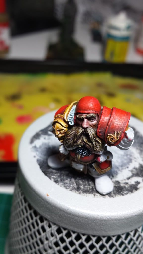
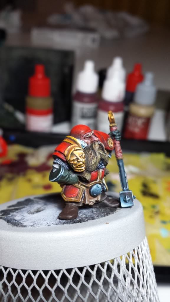
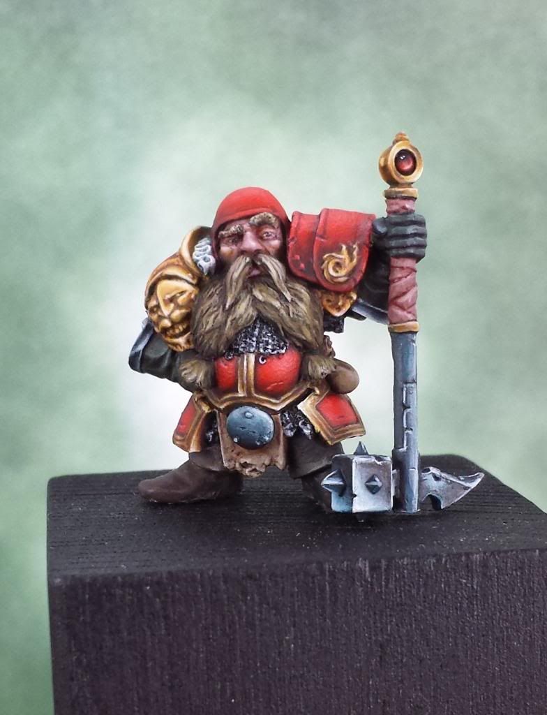
Posted: Thu Aug 08, 2013 8:17 am
by Aniku
New advances...
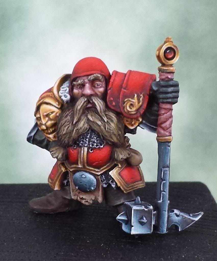
First of all, I have painted hihglight layer on the golden nmm and as you said looks better.
Finished gloves, details on silver nmm finished, and a rear bag advanced. I'm already seeing the end of the tunnel.
So, what do you think abou it? Any extra advice?
Pd: Not the best pics I have ever made, sorry...
Re: Aniku's WIPs
Posted: Mon Aug 12, 2013 8:21 am
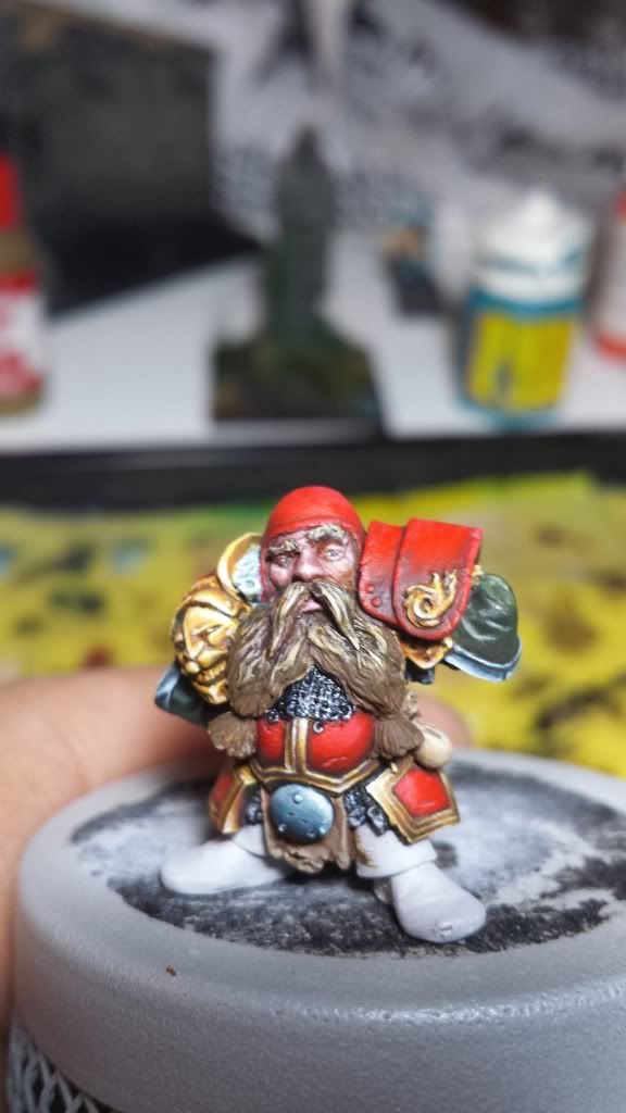
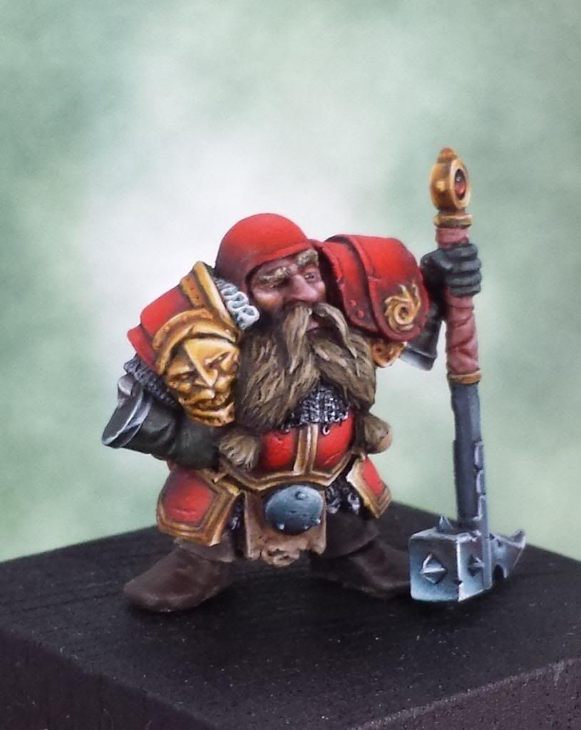
by Aniku
Well, the miniature is almost done. I know I have some work to do (mostly on the face and the boots that are not painted just coloured) but I'm going to leave it now because I need to pass to another miniature. In a cople of weeks I'll be back with it.
The pics
Many thanks.
Bye!!
Re: Aniku's WIPs
Posted: Mon Aug 12, 2013 3:44 pm
by Azhrarn
Looking really good there Aniku.

Beautiful details al around.
Re: Aniku's WIPs
Posted: Mon Aug 26, 2013 8:28 am
by Aniku
New advances and worst photos...
Many thanks.
Bye!
Re: Aniku's WIPs
Posted: Mon Sep 02, 2013 7:55 am
by Aniku
New advances...
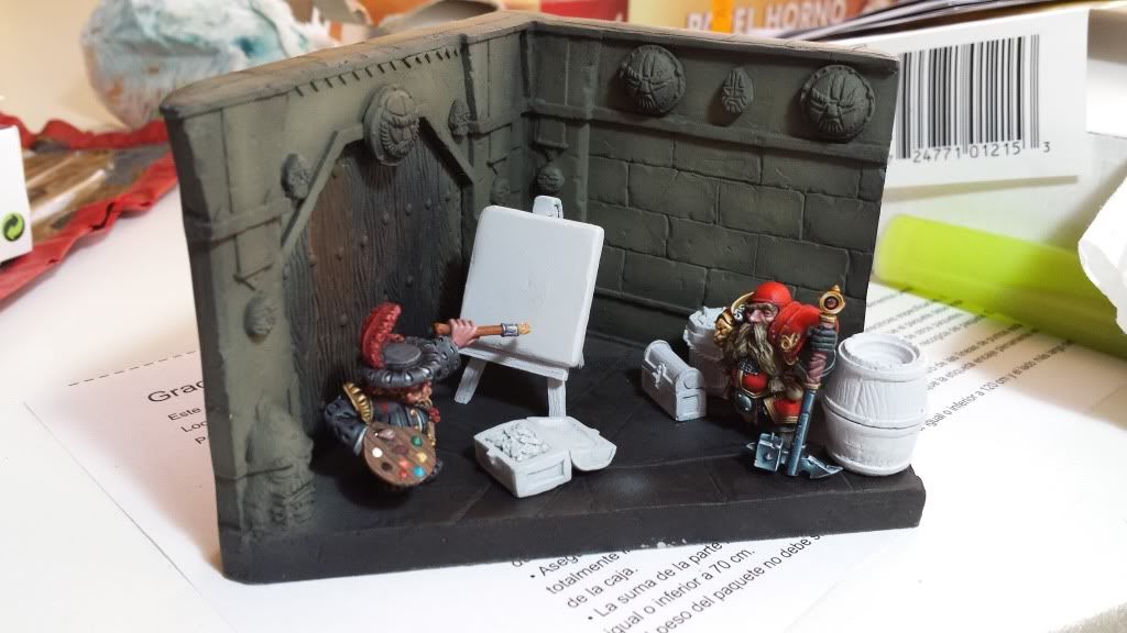
One pic of the painter finished, three pics of a general view and 2 of the walls...
I want to finish it as soon as possible to work with my Darklands miniatures...
Many thanks!!!
Bye!!
Re: Aniku's WIPs
Posted: Mon Sep 02, 2013 2:19 pm
by darthmarsh
That's bloody awesome!
Re: Aniku's WIPs
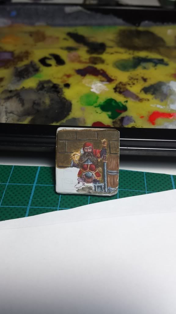
Posted: Thu Sep 05, 2013 11:09 am
by Aniku
Here you have new advances
What you will see...
More contrast on the walls, increasing the light and also the shadows
The picture. Yes, I'm not Velazquez but I think is good enough for the scene.
I have changed the position of some elements in order to create more space.
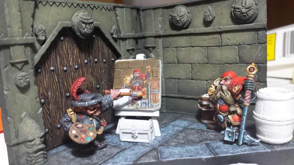
Well, what do you think??
I'm quite happy...
Many thanks.
Bye.
Re: Aniku's WIPs
Posted: Thu Sep 05, 2013 11:12 am
by AndyS
I think his brush is too big!
Re: Aniku's WIPs
Posted: Thu Sep 05, 2013 12:00 pm
by Aniku
Yes, it is...

A new technic call drybrushing over the canvas????
Many thanks.
Bye!
Re: Aniku's WIPs
Posted: Tue Sep 10, 2013 8:01 pm
by doodlekid00
I absolutely love the idea behind this. It is really cool. I love the paint job as well. The warhammer looks awesome. Hope to see more from you in the future.
Re: Aniku's WIPs
Posted: Tue Sep 17, 2013 11:18 am
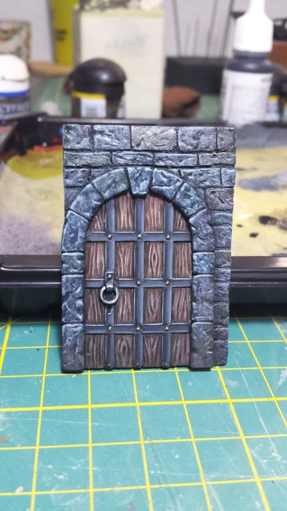
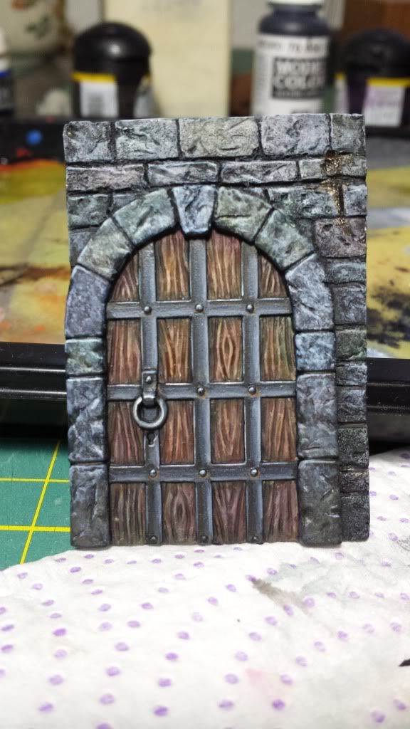
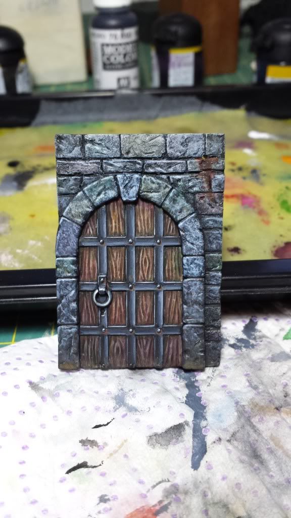
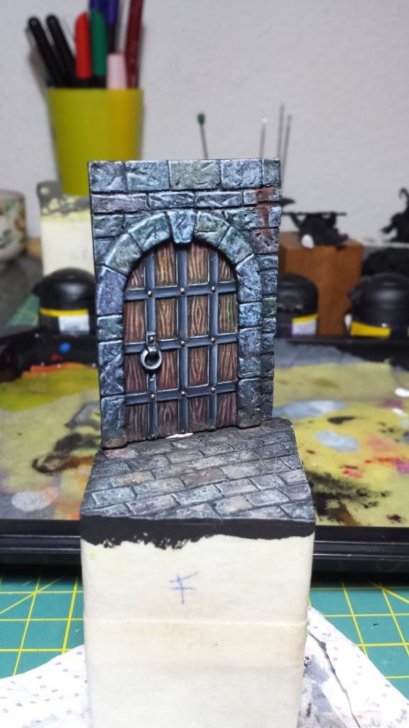
by Aniku
Hi,
After some rest I'm back!!
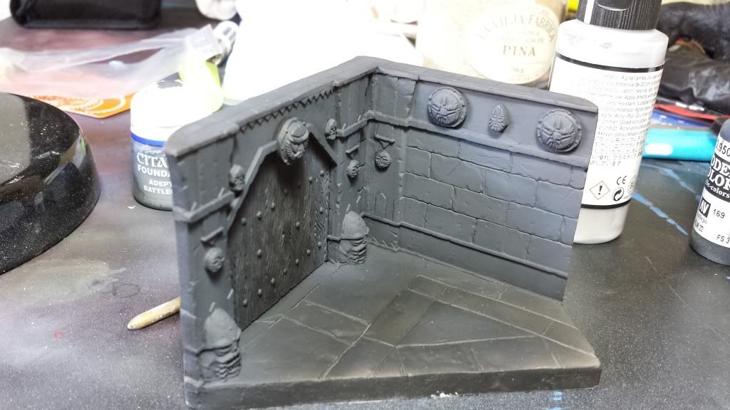
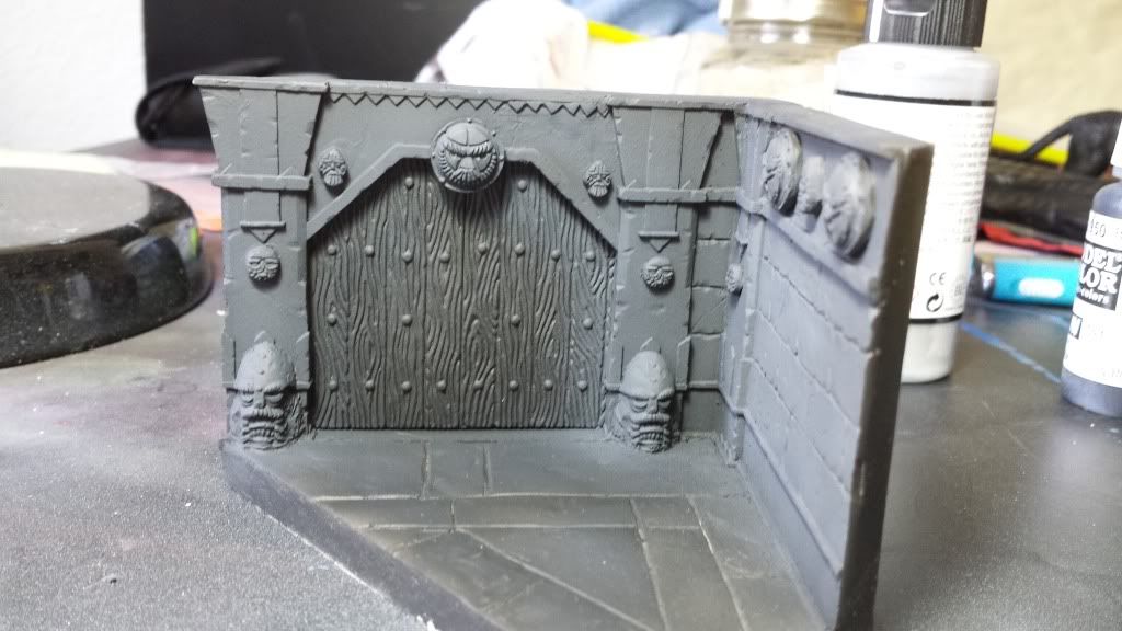
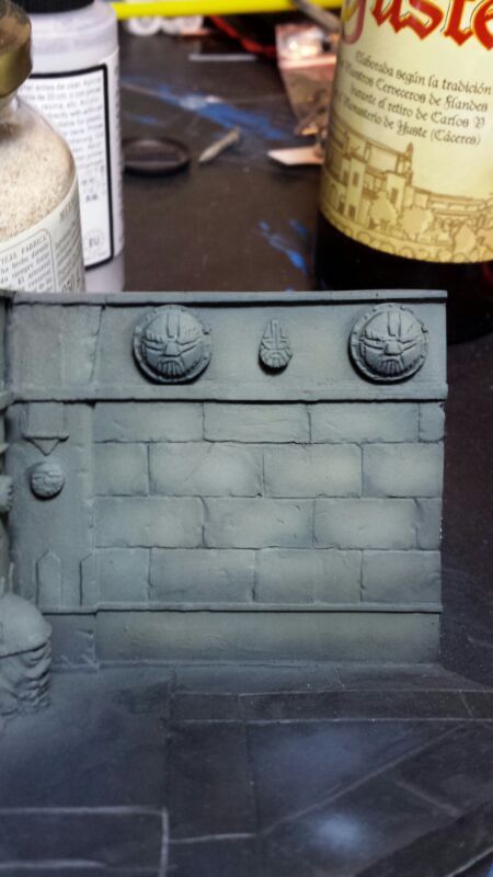
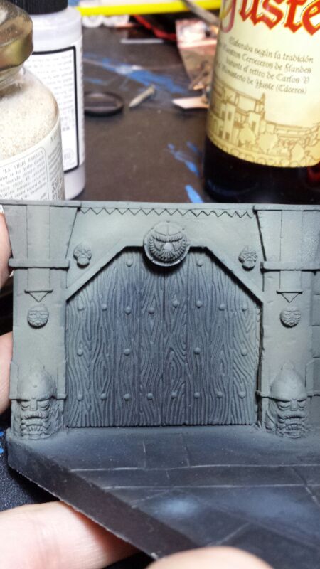
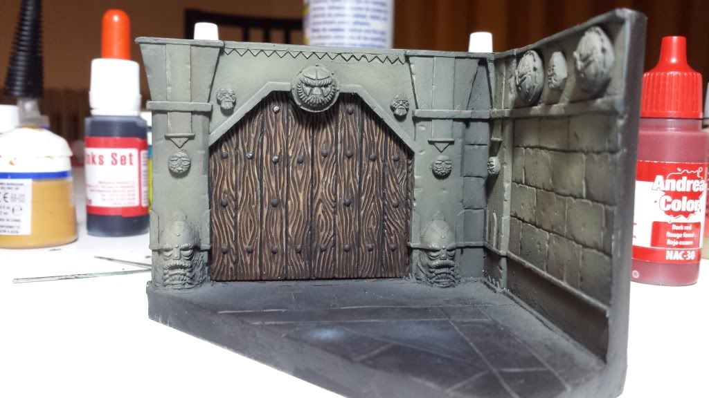
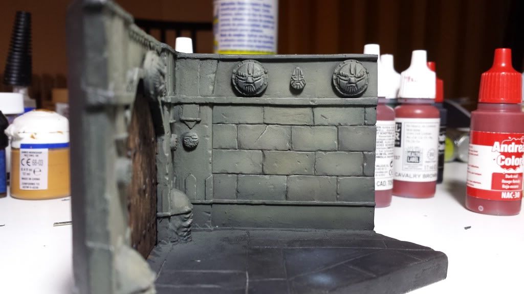
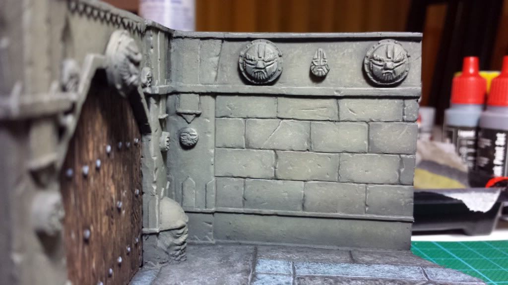
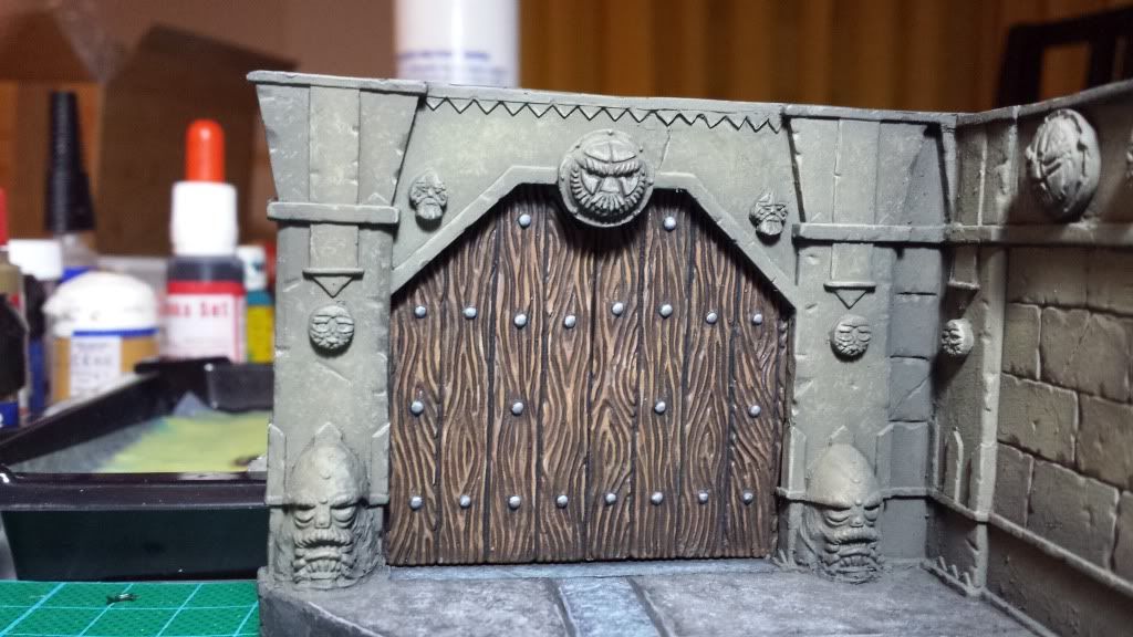
Fisrt, some pics to see the work on the door and the bricks.
And now some general pics to see how it will be when I finished it. Hopefully at the end of the week. I have a lot of Darklands miniatures waiting for me!!!!
Many thanks.
Bye!
Re: Aniku's WIPs
Posted: Fri Sep 27, 2013 9:12 pm
by Aniku
Work finished!!!!!
I have posted the pics on "Finished Work".
Many thanks...
Now, let´s go with Darrklands Miniatures.
Re: Aniku's WIPs
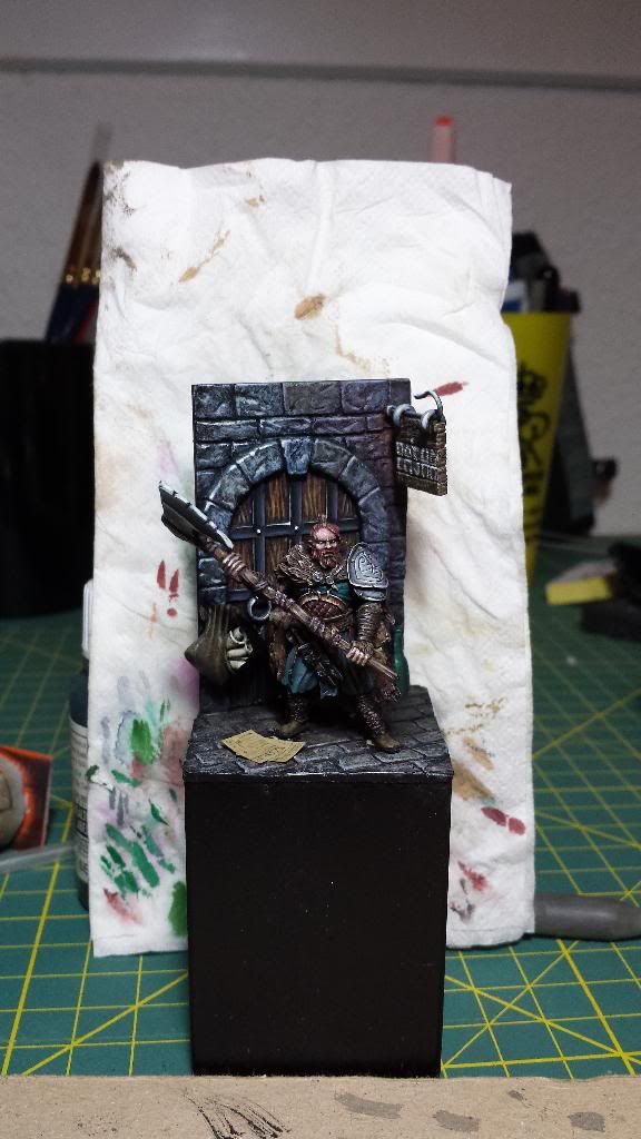
Posted: Tue Jan 21, 2014 11:16 am
by Aniku
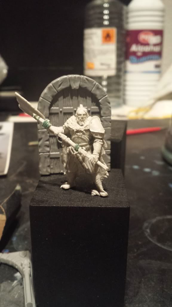
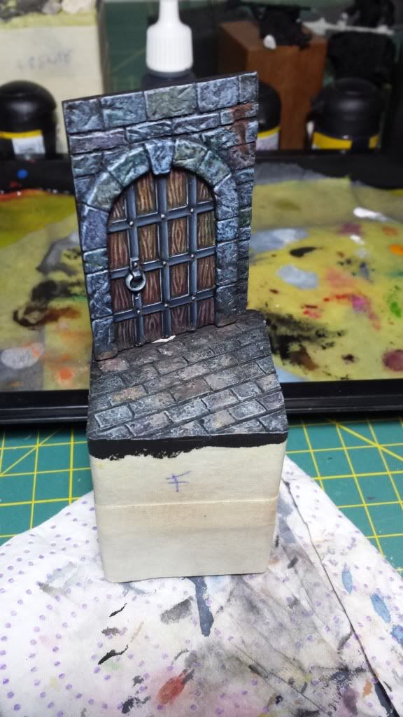
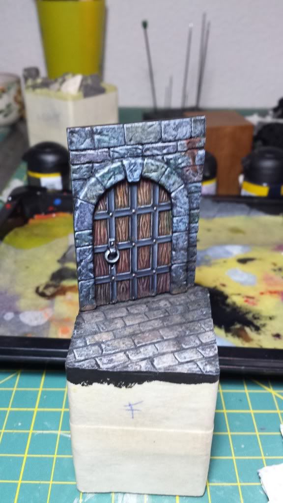
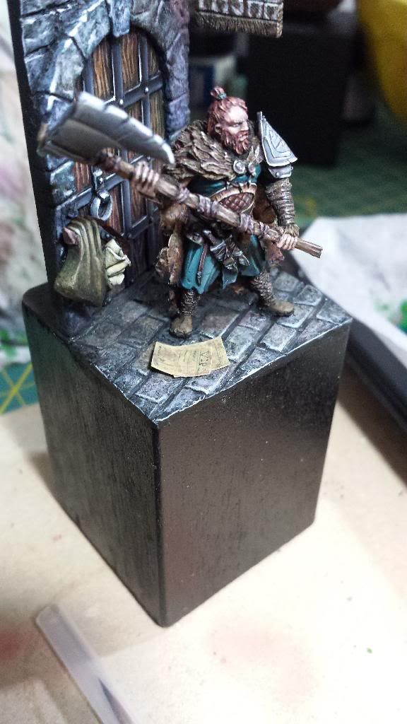
I'm back... and with a Darklands miniature.
The scene is called "You are not on the list".
I have advance pretty much before post it so it's quite close to be finished.
If you don't mind I'm going to post all the pics showing you the process:
First idea
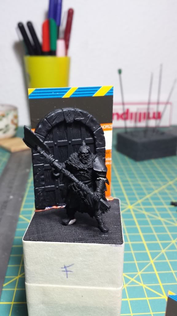
Door wit wall and floor
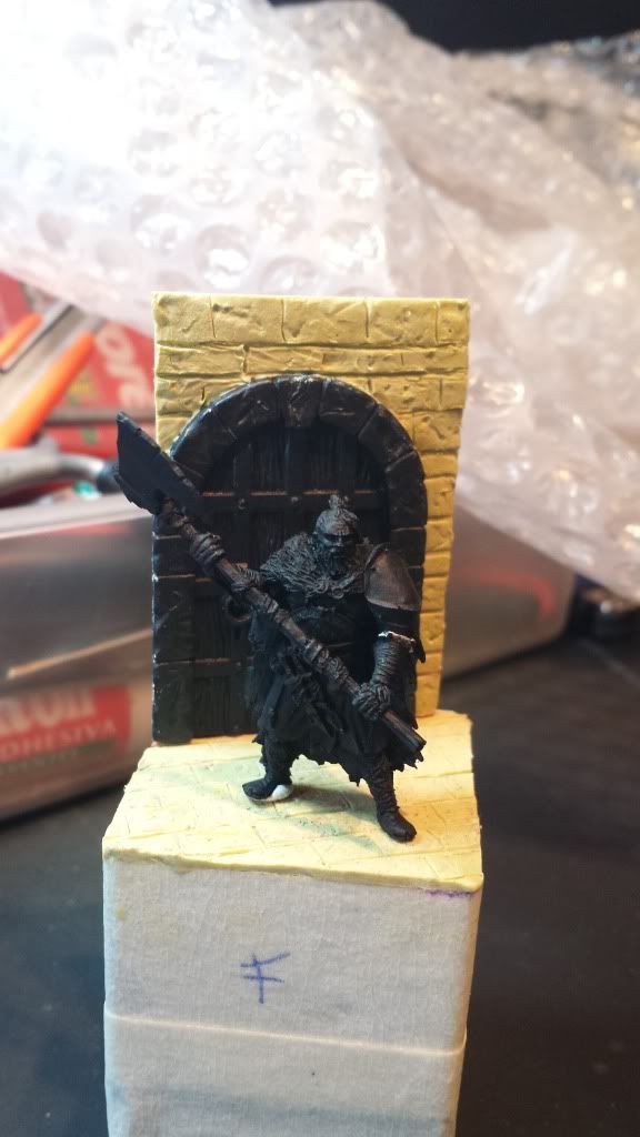
Advaces on the wall, the floor, etc
Paint phase:
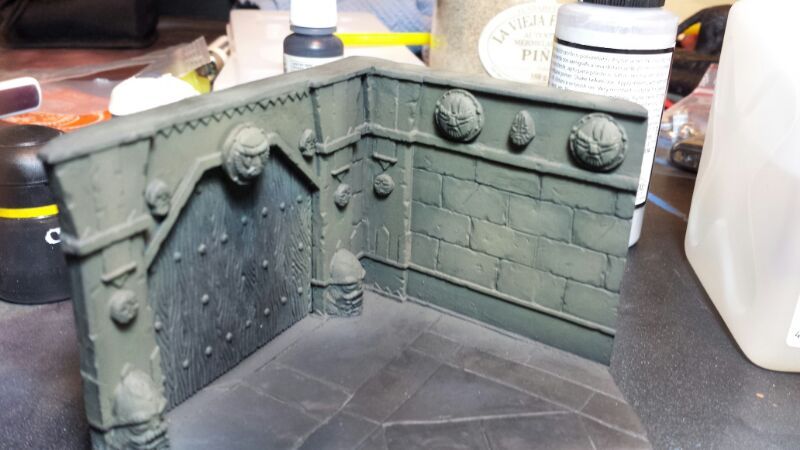
Some colors and tones on the wall
Advances on the metal
More tones!!!
The floor and pigments
Some lights and efects
Control pic
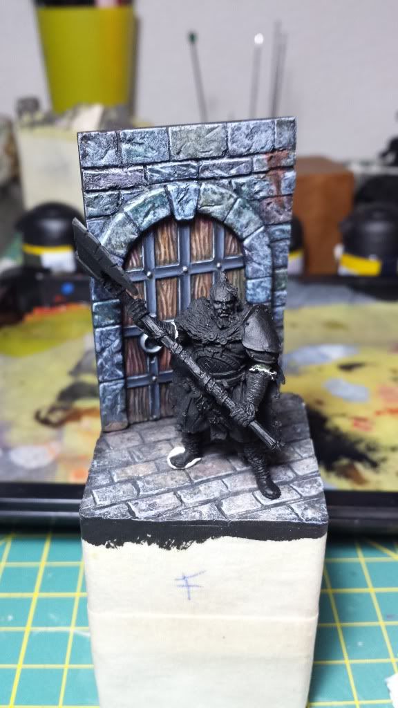
More advances on the scene
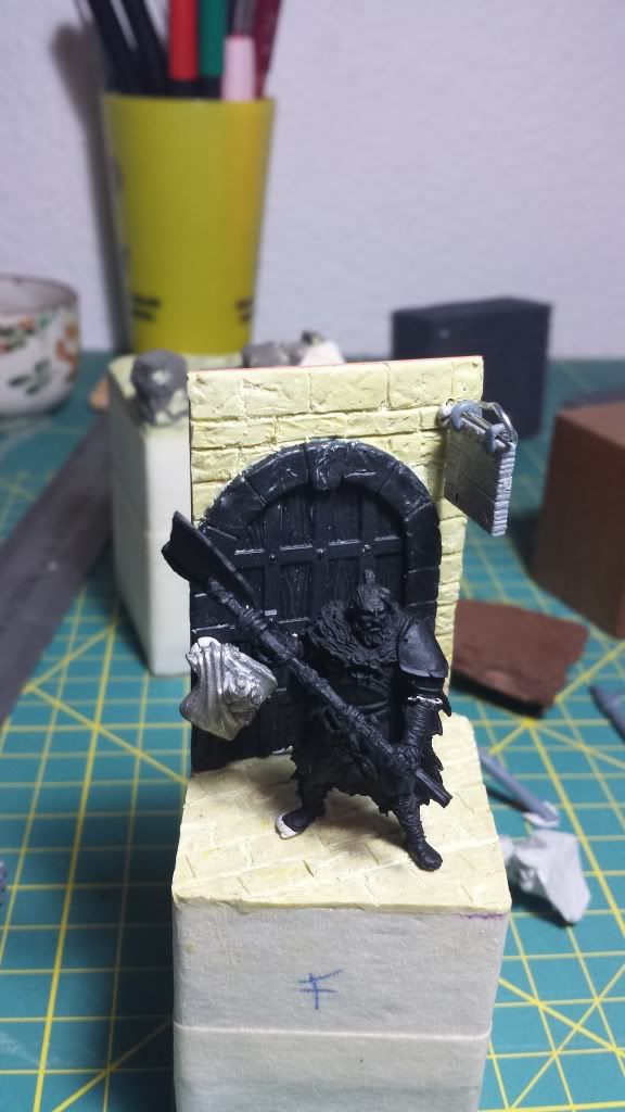
The porter
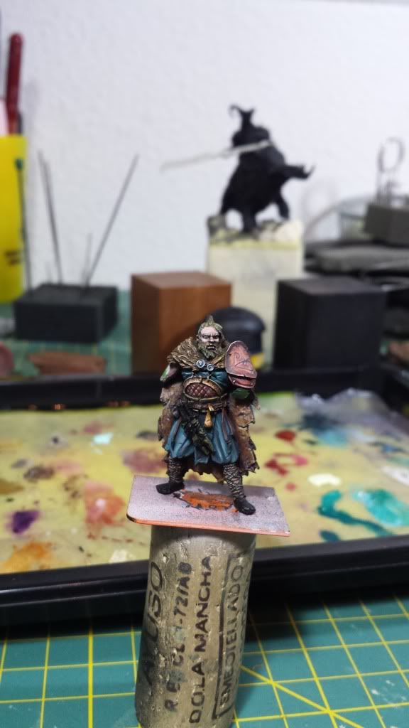
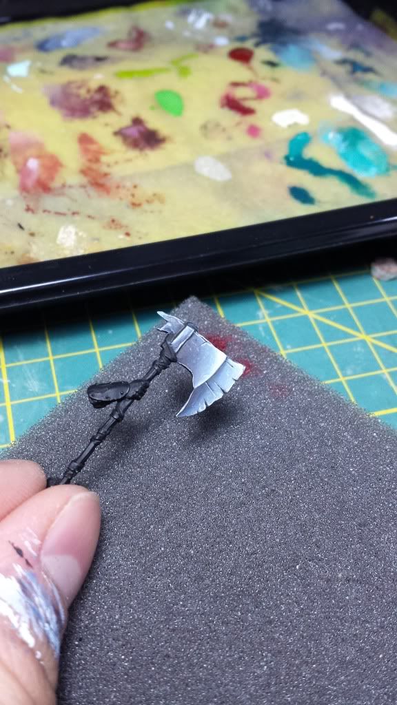
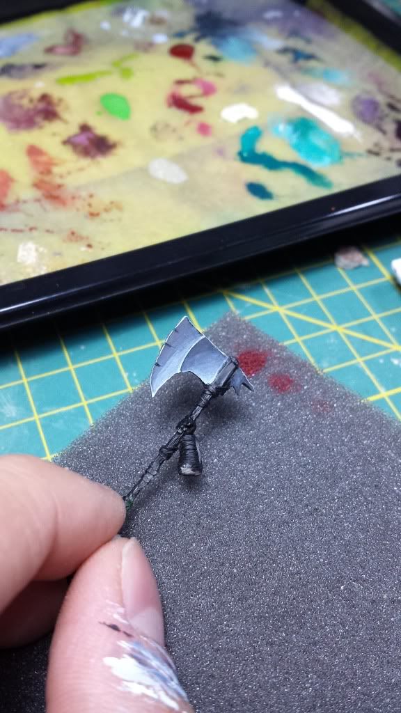
The axe
El hacha:
Gay with the axe
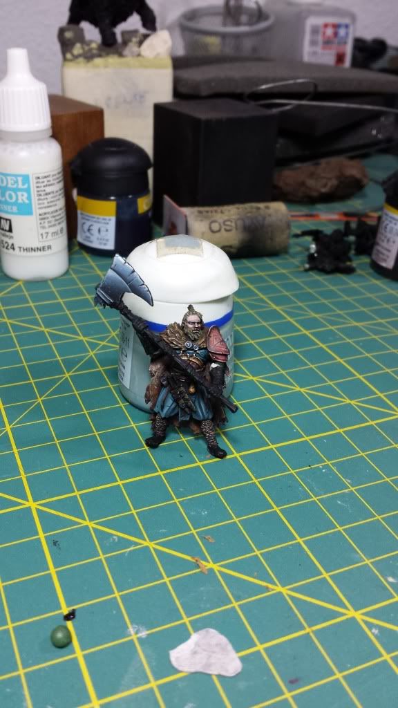
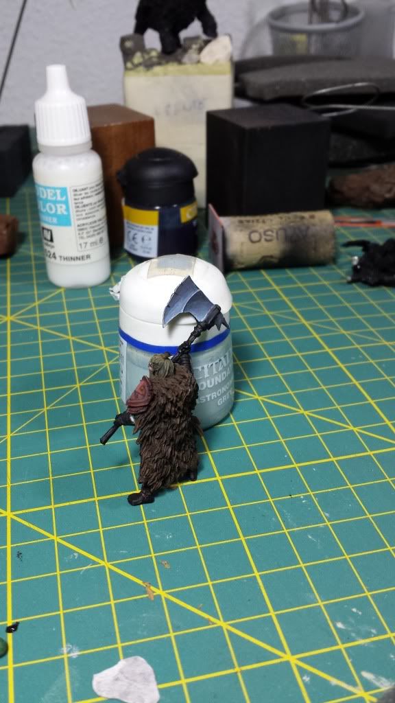
All together
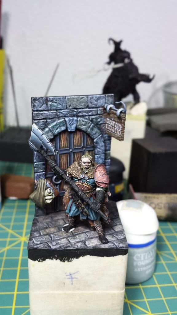
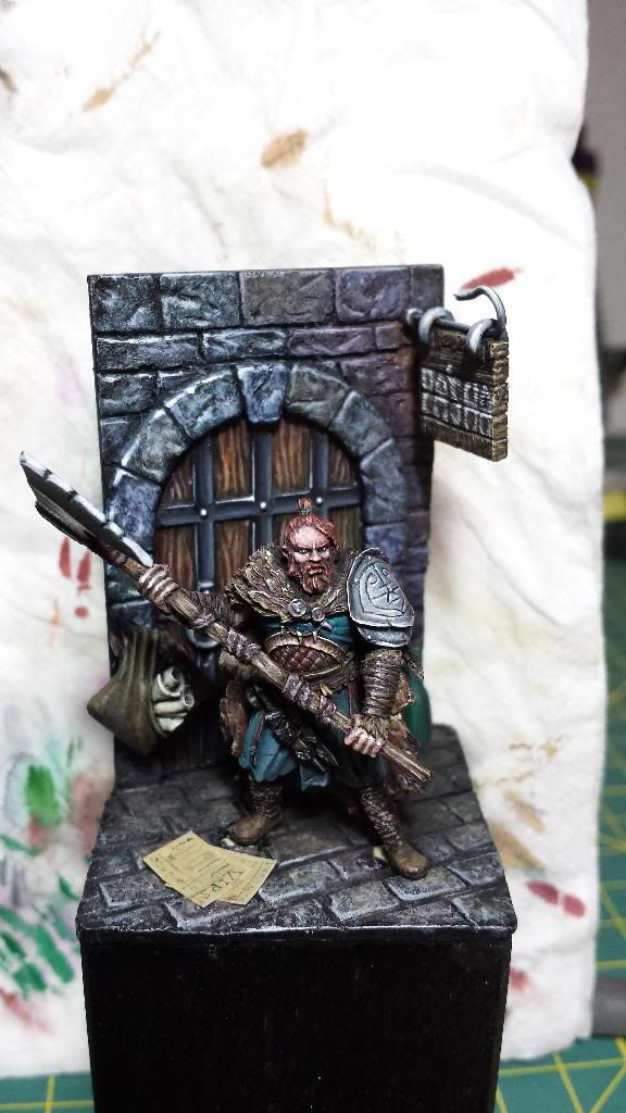
And the actual situation (I have repainted the hair, the shoulder portection, etc)
So, what do you think about it? Any advice?
Re: Aniku's WIPs
Posted: Tue Jan 21, 2014 12:49 pm
by AndyS
That is looking great!
Re: Aniku's WIPs
Posted: Tue Jan 21, 2014 1:04 pm
by razormage
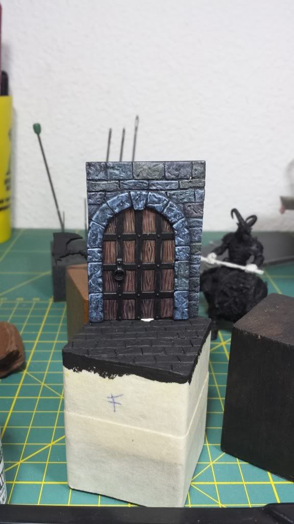
As ever, I'm loving your non-metallic metals, particularly on the door. I think going silver for that shoulder pad is the right choice as well; the bronze was blending into his cloak. Did you sculpt the door and wall yourself?
Re: Aniku's WIPs
Posted: Tue Jan 21, 2014 1:31 pm
by Aniku
Razormage, thank you very much for your appretiation. Answer to your question: the door is a GW door or I think so. The wall was sculpted.
Many thanks,.
Ciao!
Re: Aniku's WIPs
Posted: Tue Jan 21, 2014 2:59 pm
by wrinklestiltskin
Awesome painting, I especially like the brown/red tone in combination with the blue tunic. You must have quite some hours in that miniature.
Re: Aniku's WIPs
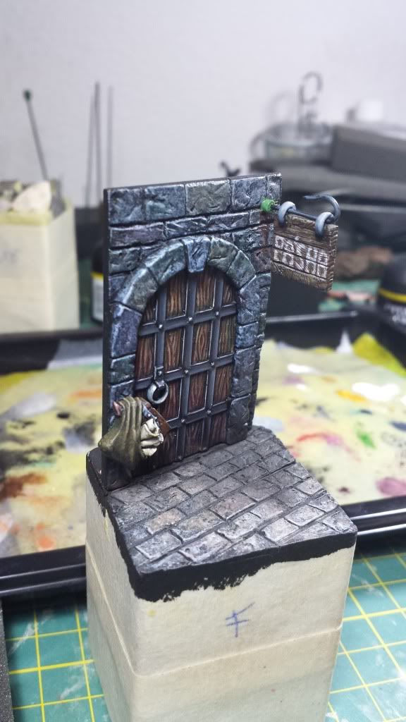
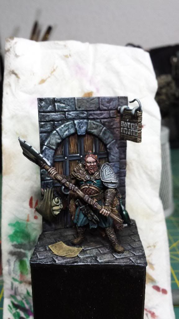
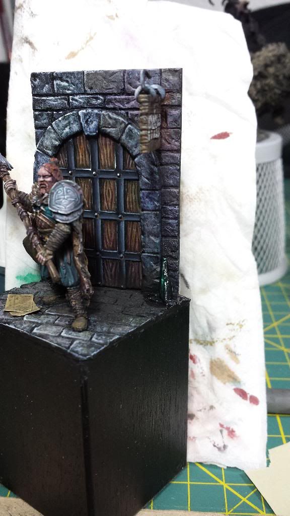
Posted: Wed Jan 22, 2014 1:30 pm
by Aniku
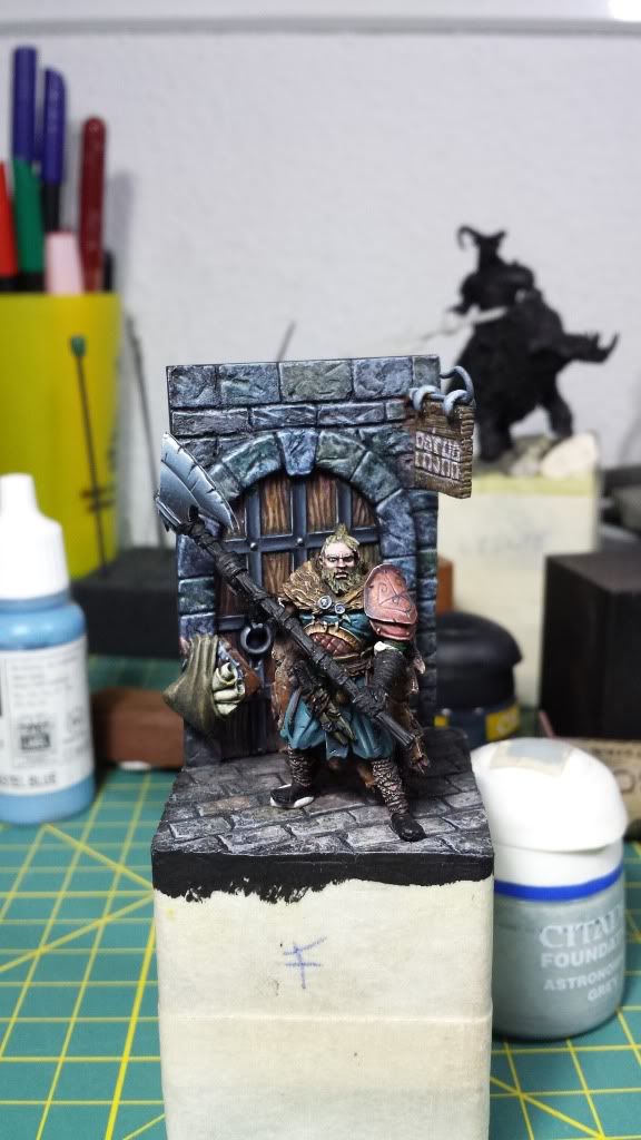
Hi everyone.
A couple of new pics with new advances...
I have worked in all zones of the miniature, specifically on the shoulder protection
I have added two new elements on the base: the VIP list and a broken bottle that I have not finished to paint
Questions:
Do you think the composition is still balanced? I'm a little bit worried that the new elements have made the left side of the view heavier that the right side.
Do you add some gloss varnish around the broken bottle to simulate that it had some liquid when it get broke?
Do you paint darker the broken bottle? And the VIP list, maybe it could be better if I paint it darker?
Pics (not the best quality)
Thank you very much.
Ciao!!!
Re: Aniku's WIPs
Posted: Thu Jan 23, 2014 1:27 pm
by AndyS
Still looking great! Is that the bottle behind him? It's not noticably broken.
Re: Aniku's WIPs
Posted: Thu Jan 23, 2014 2:42 pm
by AndyP
Great looking piece. From the angles we can see, I don't think there is a problem with composition. Can't see the bottles fully so hard to comment, but some spilled liquid could look good. VIP list could benefit from looking dirtier maybe.
Re: Aniku's WIPs
Posted: Fri Jan 24, 2014 9:58 am
by Aniku
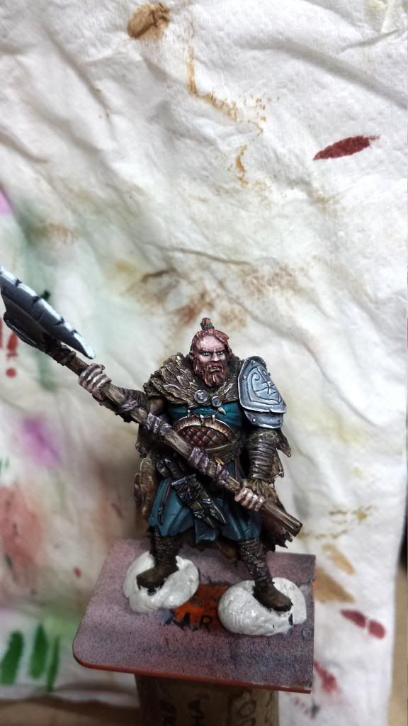
Hello,
Thank you for the comments.
In the absence of the final card with the tittle the miniature is finished (or I think so).
I added the broj¡ken bottle and the liquid, the shoulder protection, add some dirty on the VIP list... a little bit of everything.
Pics:
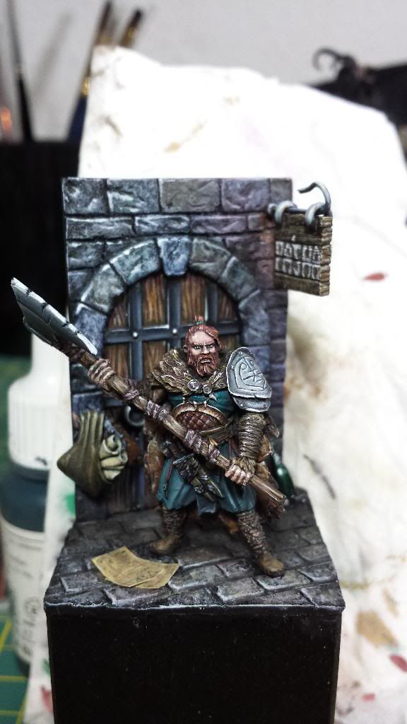
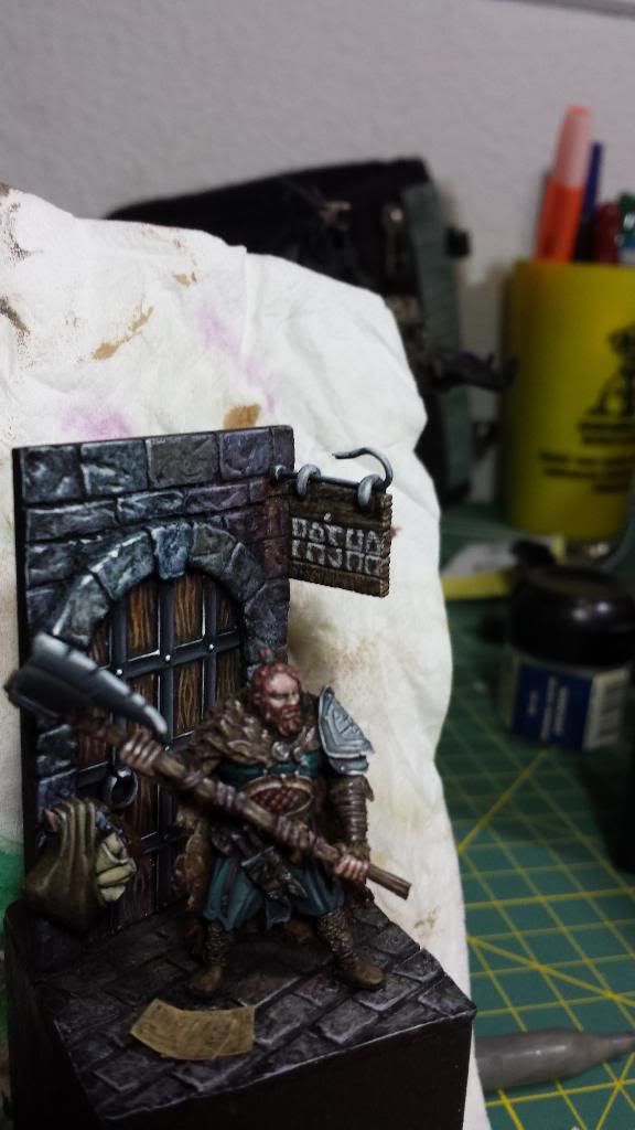
Hope you like it.
Many thanks.
Ciao!
Re: Aniku's WIPs
Posted: Fri Jan 24, 2014 11:16 am
by AndyP
Nice. Cracking job, the slight alterations work well. Looks great.
Re: Aniku's WIPs
Posted: Thu Jan 30, 2014 12:24 pm
by Malachi B.
Woot, this is a cool work Aniku! Lf to c more Dark landers painted, enjoy!
Re: Aniku's WIPs
Posted: Thu Jan 30, 2014 12:36 pm
by Slinky
Amazing stuff!
Re: Aniku's WIPs
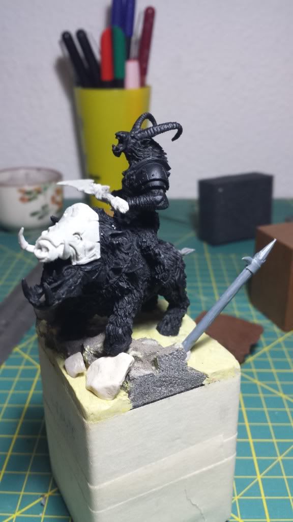
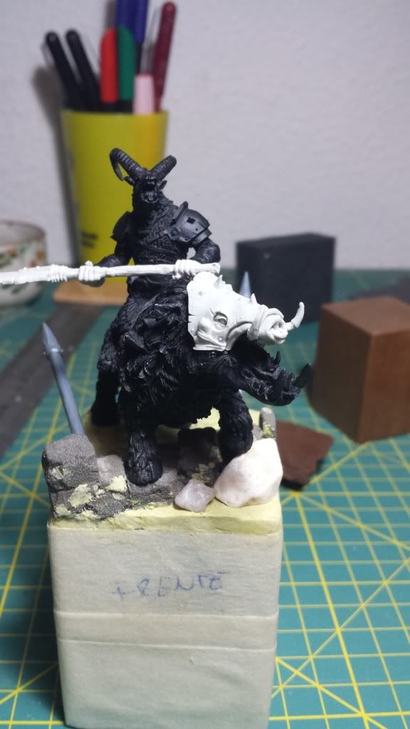
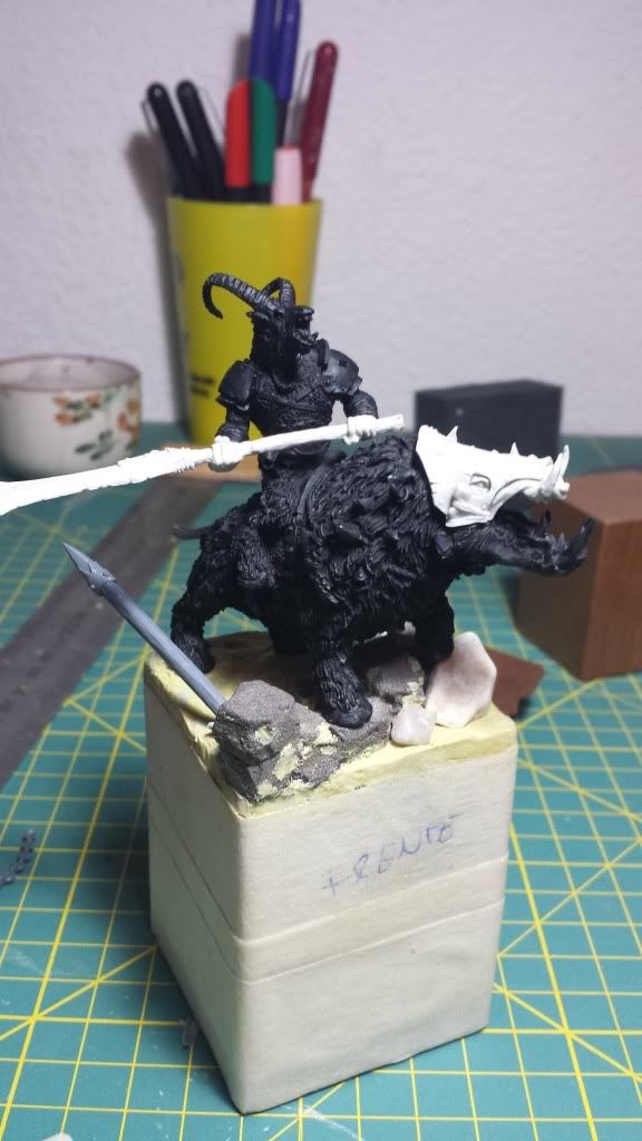
Posted: Thu Jan 30, 2014 2:15 pm
by Aniku
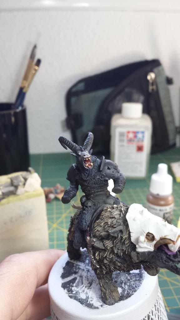
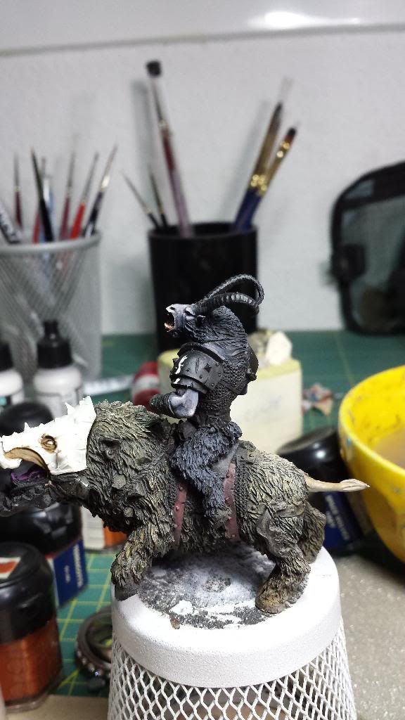
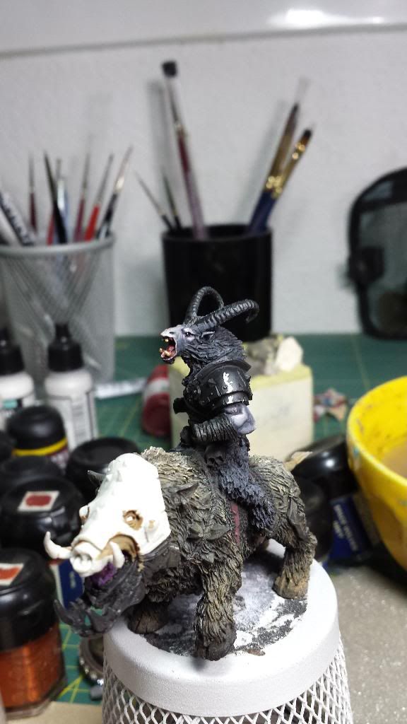
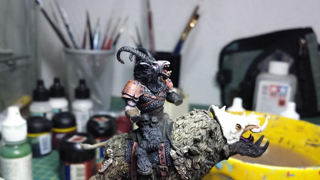
Next stop in Darklands miniatures...
A beastman in a giant boar (Chaamakuk ar something like that).
I want to paint this one on a winter scheme so comments and critics are neeeded.
First step with airbrush:
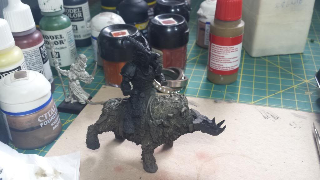
Some advances in kight and some details:
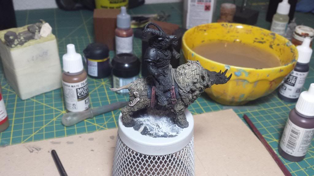
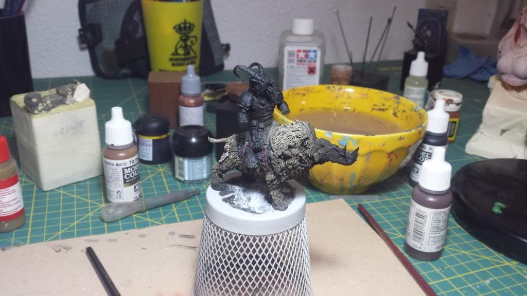
Closed pic:
Many thanks.
Ciao!!
Re: Aniku's WIPs
Posted: Thu Jan 30, 2014 2:26 pm
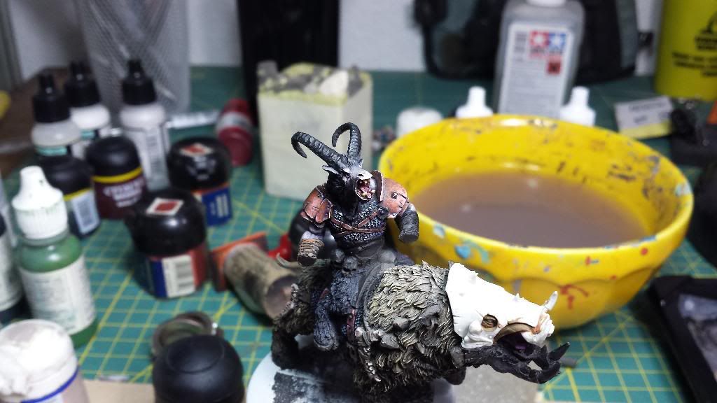
by Aniku
Thank you for the comments on the previous work... Now it is on finished projects and, hopefully, in a short time you will find a link to vote it on coolminiornot.
And some extra pics of the new project. I forget to post pics of the scene...
Many thanks.
Ciao!
Re: Aniku's WIPs
Posted: Mon Feb 03, 2014 8:59 am
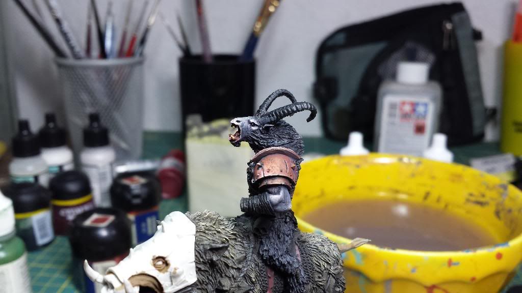
by Aniku
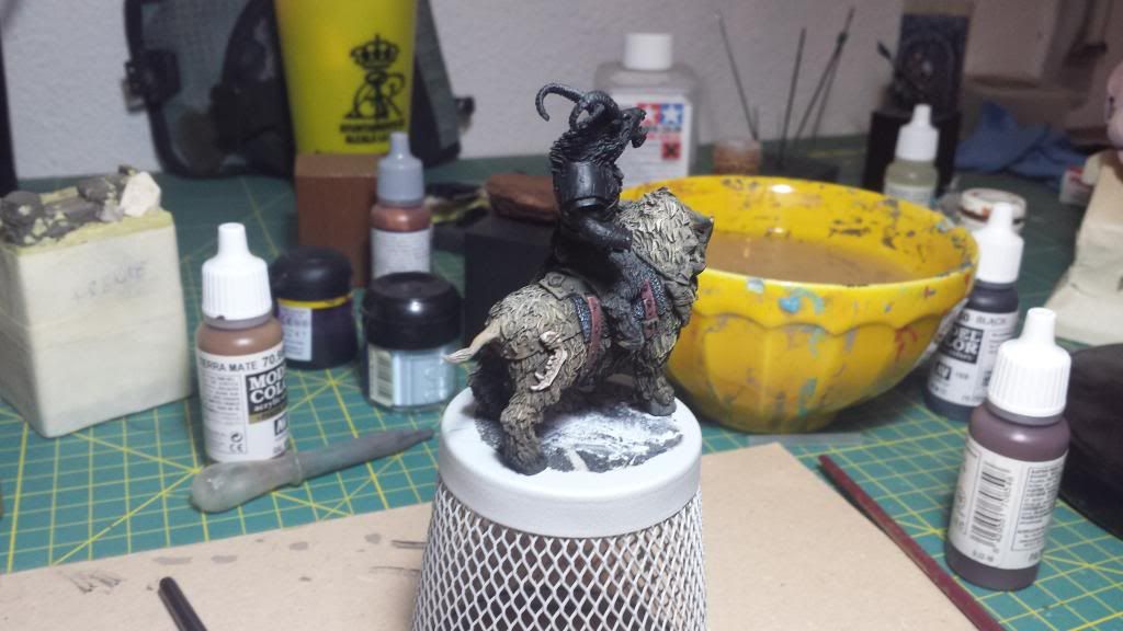
New advances. Now on the beastman skin. I'm looking for a dark skin with some purple and blue tones that combine with the winter scheme that I want.
Any advice to paint the fur (hair)? I'm quite sure I'm going to have problems to paint it.
First steps on the skin. As a curiosity, I can say that I am using the colors of Andrea's black set:
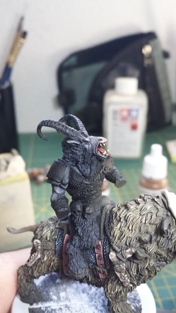
More advances. Adding some purple or/and blue to the paint mix. Or even glazing with that colors:
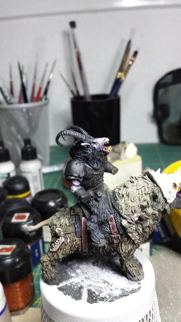
Before I finish the skin I began to paint the shoulder protection. I was just a little boring so I experimented with colors and the way a used the brushed to paint, quite close to a dotted. Now I'm not sure if a wanted to paint a bronce or a very rusty protection, I don't mind, I like the way it looks. Both of them are not finished:
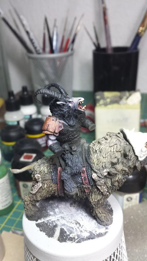
And that's all. Hope you like it and help me to get a better painted miniature and to improve my painting skill
Muchas gracias.
Adiós!!
Re: Aniku's WIPs
Posted: Mon Feb 03, 2014 2:31 pm
by Malachi B.
Face is com in out great I think, and overall I get the impression that with colours u did a nice choice. I boughtsame model from MM, so i am very interested to see your work on this; maybe I can learn something. Salute!
Re: Aniku's WIPs
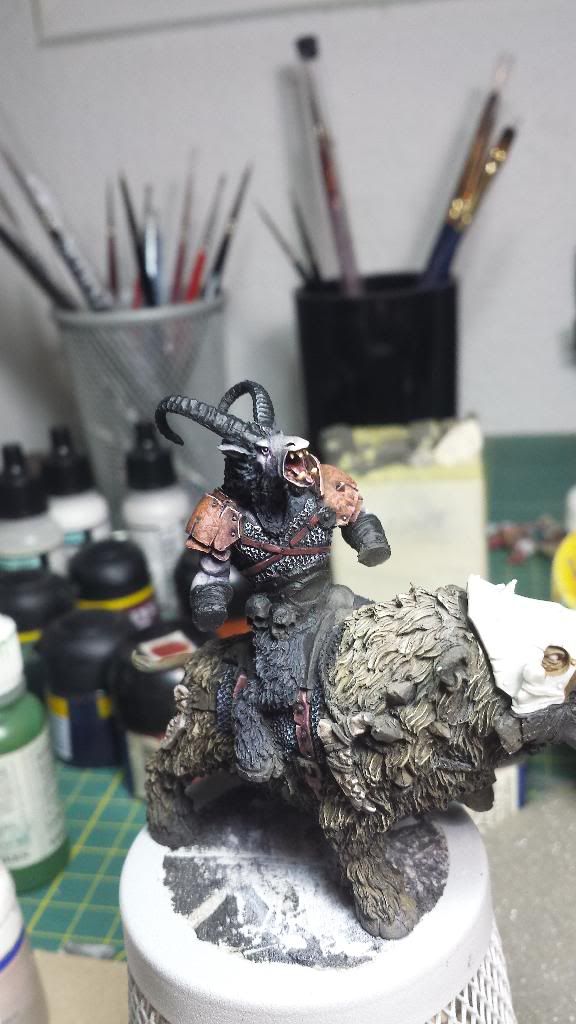
Posted: Tue Feb 04, 2014 9:20 am
by Aniku
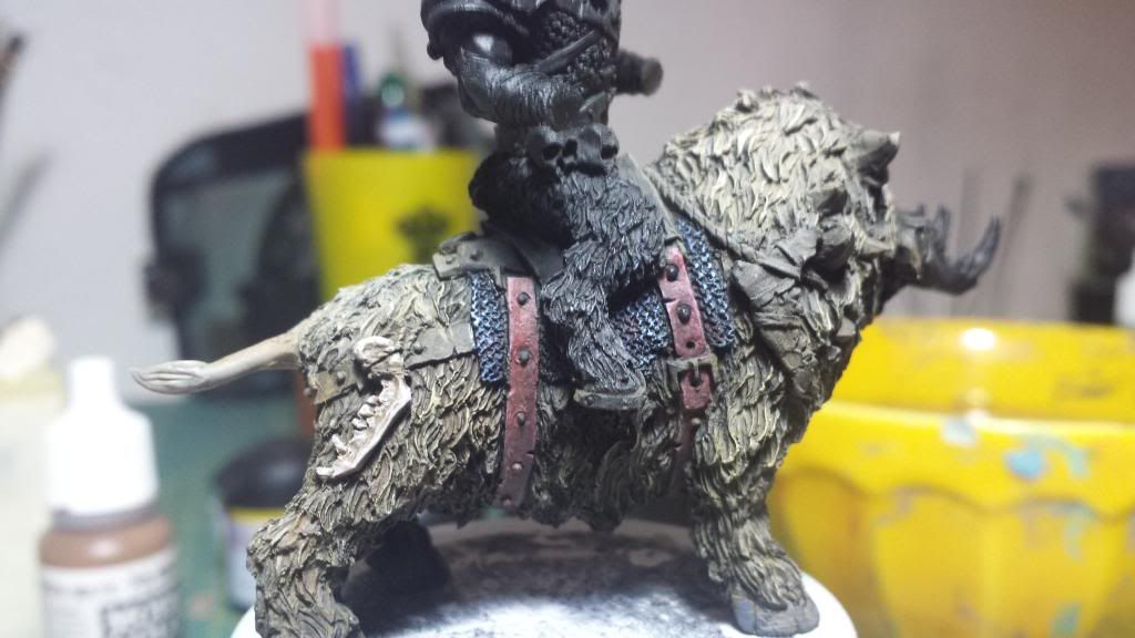
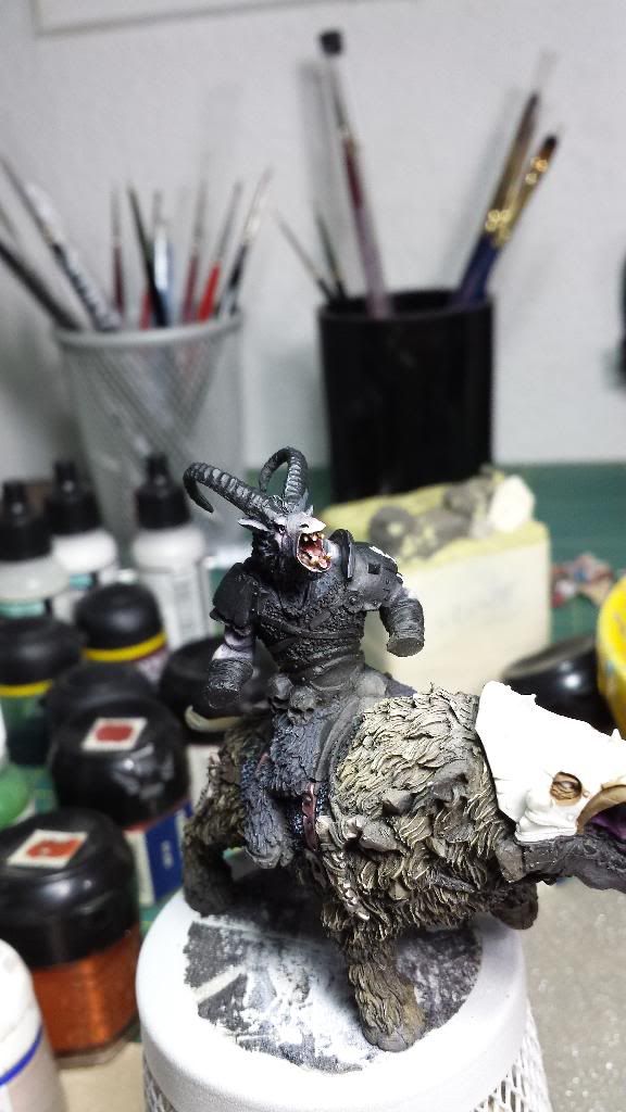
Yesterday I hadnt as much time as I expected so I have not advanced as much as I would have liked.
I have advanced in the shoulders protection, the leather headband and the chain-mail. Of course all unfinished (Im a disaster). In addition, I have worked more on the face to give more contrast and force the tone purple around the eyes.
What do you think?
C'mon tell me all the fails and how to improve the painting work...
Many thanks.
Adiós!!
Re: Aniku's WIPs
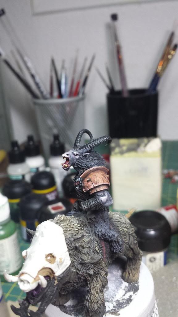
Posted: Tue Feb 04, 2014 5:58 pm
by razormage
I think you'd benefit a bit from a brown, purple, and/or black wash on the fur to stress the dark contrasts a bit more.
I love - let me emphasize that: LOVE - the stippling effect on the brass armor. I'm stealing that idea from you if you don't mind. I'm personally not a fan of silver highlights on gold armor, but it's a pure preference on my part and not at all a criticism; it's a perfectly valid technique.


